Sihirli Elma
goktuggedik | Sat, 07/12/2014 - 16:36
Brief from client
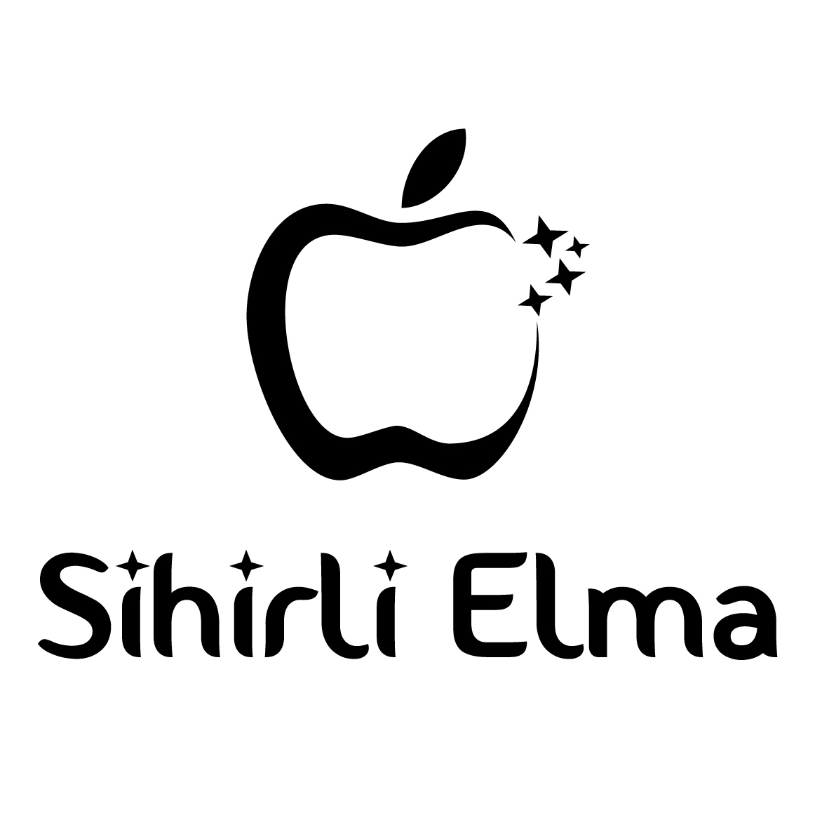
Sihirli Elma is a blog for Turkish Apple fans. It is focused on news, tips & tricks, guides and Mac101 posts.
By the way, "Sihirli Elma" means "Magical Apple" in Turkish.
4 Comments
Haaa, here's the kind of post I like. Someone who make the effort to type in English and gives a bit of context. Thank you for that, because it's not always the case.
Now, this logo isn't really working, unfortunately. Globally, it's too flimsy, it lacks character and it's not really impactful.
The apple symbol looks way too random. Apples are better to be avoided since it's way too associated with Apple the corporation.
I know your logo aims at Apple fans, so you're right in using this kind of symbol, but I'll look for a more subtle way to use it, something looking more like the actual Apple logo, but with a twist, something more personal. Hey why not forgetting about the apple and making a spoof logo with a peer or a banana? =)
The stars are in my opinion not really needed, especially in the word mark.
Good luck!
Great comments, thank you for your feedback. I really appreciate that. :)
The one thing I don't agree with you is that forgetting about the apple and using a pear or else... But apart from that, I really think I need a better logo.
Maybe I should start another contest on 99designs.com? :)
Cheers,
Goktug
Please, don't do anything with 99designs! These type of sites are a scourge to the business, as they ask thousands of graphic designers to work for free, in the hope a winning a few hundred bucks. Not only does it kill the business, but also the general quality of the work.
Since the name is related to Magic (Sihirli) you can play on that. The stars you've used do not really reflect the idea of magic, and I do not think you will need to repeat it again with the type.
The font is not really a good choice.