SilkSign
mahayni | Thu, 05/01/2014 - 12:56
Brief from client
Create a new logo for a signage company that manufactures signage, letters, boards and banners.
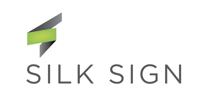
A study, this is the fist draft. It is for a signage / banner manufacturer. I have used the letter (S) and tried to make it look like a banner.
There is a calligraphy background, in old days (and even till this date) some calligraphers are still using those cloth banners (similar to thrones used in protest :)).
8 Comments
thumbs up for all, but try to align the symbol with the typo. Also try with other typefaces, i guess more emphasis would go better. For the moment is everything ok but is just an usual, simple, easy to pass logo. Integrate some cuts of the symbol in the font put them in harmony , add some contrast and vibrance.
Thanks. Can you explain what you mean by (align the symbol with the logo)?
what is to be explained? align, vertically or horizontally with the typeface. it is useful for aesthetic stuff like symmetry.
idea is good, symbol has to fine-tune some more.
spam
WTF?
That big shiny link just throws a big shadow on the real intentions of the guy.
Yep