SirOrin Nature Photography
AnnaliseVanessa | Tue, 06/16/2015 - 04:58
Brief from client
Trying to encourage my cousin to open his own photography business by making him a logo. He's an awesome nature photographer so I tried to theme it around that, and he likes snakes, a lot.
It's supposed to be fresh, and interesting; he's not a cursive and flourish type of guy.
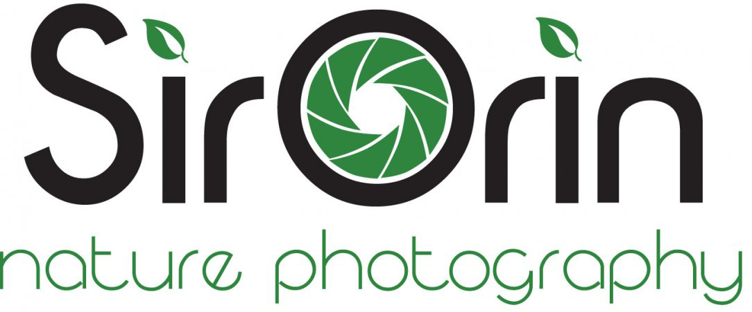
Still editing it, but I want some extra professional critique
8 Comments
I like overall feel of the start here. I wouldn't place leafs over " i ".Welding a snake with an " n " doesn't work, it looks as an extension cord or a cable. I'm not sold on your attempt to wrap a snake around a shatter part of camera, it looks clutter. I would like to make a suggestion for you,Annalise Vanessa - what if you rotate leafs in a shutter part instead of these boring blades to make it more interesting, thinking outside of box a bit? Your upper case " S " could be very well draw into a snake. Good work , good luck.
One logo per post, please. That's the policy here :)
Sorry Didn't know
Sorry this does not work for me. The idea is too common, shutters for photographers are everywhere, and the leaves look tacked on as an after thought. The font is very dated in a bad way, like an 80s attempt at art deco. Lastly the color green is to artificial to represent nature. Try working with subdued or olive greens, a more timeless or modern but not trendy font. I personally stay away from icons for letters, look at list of award winning successful logos and you'll see it's rarely done and usually subtile if it is. You do have a very clean presentation, I'd start sketching and try to find some idea that evokes nature/photography that isn't cliche.
This echoes my sentiment as well.
I was actually hoping you'd post the ones with the snakes, so I could comment on those.
I wouldn't be as severe as my esteemed colleagues. I think this logo is still salvageable.
Get rid of the leaves and that horrendous aperture symbol, which is the most uncreative idea ever, as far as photographers are concerned. Change the font of the subtext. Find another one which compliments the main word mark. It's also good to note that a baseline should NOT be part of the logo though you can have an iteration with it.
Keep the font, which I like, and that big O in the middle. I think it can work.
Good luck.
Just ditch all the extra fluff and this would be nice, I agree.
The font somehow reminds me of The Onion, but otherwise I think its pretty successful.