SirOrin Nature Photography
AnnaliseVanessa | Thu, 06/18/2015 - 21:25
Brief from client
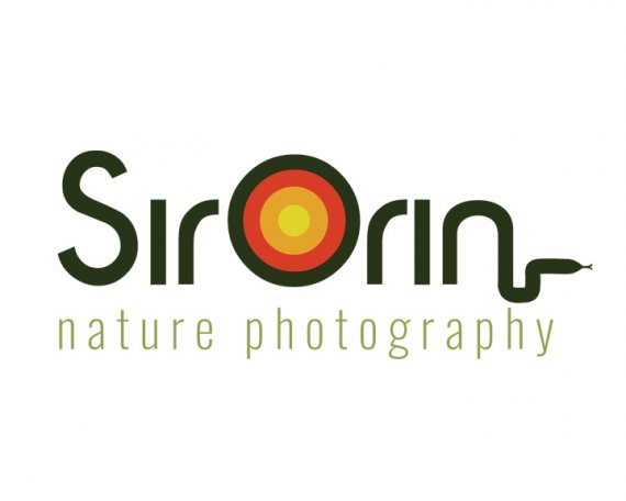
Update on SirOrin Nature photography logo. I changed the subtext font, and colors. I took off the leaves but left the snake. I took out the shutter camera parts and added something that's supposed to look like a sunset, since he takes a lot of sunset photos he told me it would be cool if it had a sunset.


6 Comments
Nice, looks like a sunset and how a lens appears when you look straight at it, very good choice. The secondary font choice is much better. If I was art directing you I would tell you to eliminate the snake and re-center the tagline. Some may like it, but I strongly feel that you have a strong professional logo with out it and a gimmicky one with it. I think you are bang on with the colors this time including the muted oranges in the O.
Still too many things going on. The sun and the snake, that one symbol too many. I'd say even two. I'm sure this logo would word the best if it's totally stripped down. Just keep the big O.
Also for some reason, I keep reading "sirloin" everytime I see it =)
Sorry Shawali, I'm going to disagree with you on both the sun and the snake :)
The sun's got to go, for sure. It inhibits legibility, as I also imagined the word "sirloin." And I like the snake, personally. It gives me a "wilderness" vibe. Here's what I suggest for everything else:
1) If you want to add those tight angles at the end, choose a typeface to mimc that. Otherwise it looks a bit tacked on.
2) Your subtext alignment looks off, maybe because of the snake. Try giving it an align left and align it to the word only, sans the snake. It looks like the logo as a whole is set to the left anyway, pointing right.
3) If this were mine, I would consider experimenting with a snake tail on the S, but this can look gimmicky, so don't take my word for it. Try it out first.
5) Give it a cooler overall color scheme. The sun definitely throws it off. It doesn't even have to be all leafy greens, try teal or blue-green.
Good luck!
Three very different professional critiques, it'll be interesting to see where AV goes from here.
Let's make it four. I agree with Shawali and Fred. I disagree with Switch, sorry.I personally would love to see a main text in upper case but with O being taller.I wouldn't mind a snake, but not where it is right now - as it looks as elephant trunk the way it extended from " n " . An idea of a sunset is very good - but it didn't make it , as of yet and sort of looks as a " Target " logo. Vanessa needs to come up with a much finer execution on that. The whole thing is asking for a much finer font on both. Good luck.
Wow, thanks for all the comments, but now I'm really confused! I guess I'll just try all of them and see what works for me.