Slots Pill
slotspill | Tue, 07/14/2015 - 14:00
Brief from client
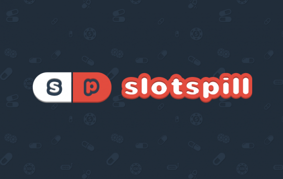
Need a logo for SlotsPill.com website. AS stated in the name, the logo should contain pill + brand name. The font for logo should be in bold + funny style.

Logo includes a Pill + Brand name. Background was designed to complete the logo theme.
About the project itself:
- Website contain free online slot machine games + Casino reviews
- The main idea around a pill is a playful comparison of sweet pills in casino world because the site provides free games, so people don't need to waste real money (bitter pill)
- Site supports two languages: English and German
Can you please also comment on logo + webdesign altogether?
I'd really appriciate that. As Thank you I can give critique for any of your logos.
Website URL: http://www.slotspill.com


14 Comments
No need to place your website link here.
I deleted the link, just wanted to give people quicker access to a website. Also, I still want to hear some critique about my logo, and (if possible) about website design.
A pill symbol has been designed already - so, there is nothing groundbreaking here. However, you can explore your chances of tying up a symbol to a casino online business that you are promoting. At the moment your symbol has no relation to that. Adding slot's machine handle, making pill into a stages as a player waiting for an image to line up to claim a prize, breaking a pill and let tokens pour out of it or even creating a slot machine screen inside of the pill would be a way to go. I would remove initials from a pill, they seems extra without any purpose. Your entire text could be applied instead... Colors are okay, but I'm thinking Poland with red/white, LOL. Perhaps, exploring into a casino's color palette would be a direction to lean. Not a bad start. Good luck.
I like the general idea but I'm not a fan of the end result.
The big ass stroke on the word mark with that inner shadow are a major turn off for me. Keep things simple.
I don't think you need to have the initials in the symbol.
I do like this color combination, though.
Thanks for removing the link. I know it sounds silly, but you really don't want to be mistaken for a spammer around here. People turn into spam eating zombies =)
Really do not like the thick outline around the font, it makes it look way too heavy.
Simple things without effects are much more pleasant.
Combining "slots" and "pill" into one word "slotspill" reads more like "Slot Spill", which makes me think of coins pouring out of a slot machine. If this site is for gaming, wouldn't the payout reward be a better message, compared to pills which could be associated with addiction (not a good connotation for gamblers)?
Isn't a gambling is addiction? I nailed this one, didn't I?
Yeah, you sure hit the nail on the head with that comment. Way to make my obvious point even more obviouser, genius.
More will follow, keep yourself lubricated.
Child.
By lubricated - I meant for you to keep plenty of water next to you, as too much foam coming out of your mouth.
Lubricate: apply a substance such as oil or grease to (an engine or component) to minimize friction and allow smooth movement.
Quench: to slake, satisfy, or allay (thirst, desires, passion, etc.).
too funny!
Well, if you mentioned " sweet pill " in a description - why then name one instead of a " slotspill "? That would be a better name and a catchy one, too.