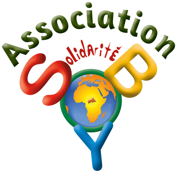
Small humanitarian organization named "Solidarité SOBOYO"
DALLOT | Tue, 07/21/2020 - 23:40
Brief from client
Soboyo in Banda language (Central African Republic) means "Enough of the misery". It was founded by women in Bangui ; and in France we created the association "Solidarité Soboyo" to support them. In addition, by assigning to the logo the colours of the Central African flag, we aim at reaching the major marketing categories of people.


3 Comments
Well, I don’t really think it’s working. First off, it doesen’t read as SOBOYO, more like SOBY or SOYB. The fonts are really bad especially de “olidarité” one and the effects on them are a no go. Also the world looks like clipart and the Y is tilted to the right but not enough to make it look like it was intentional. Simplify everything and try sketching more ideas. Keep up!
As said in the comment above, this logo is not working at all as it is impossible de read the name of the NGO. No one will ever be able to read "Soboyo" here.
It is choke-full of terrible filters such as bevel & emboss, who should basically be never used unless the designer knows exactly what they are doing. Which is absolutely not the case here.
Remember that to be effective, a logo should clear, legible, and leave a lasting impression. Unfortunately, this logo achieves none of these goals.
Less is more. You will experience problems down the line with application of the logo on various formats