Social Media Muscle
lytlgrl | Sun, 09/13/2015 - 19:04
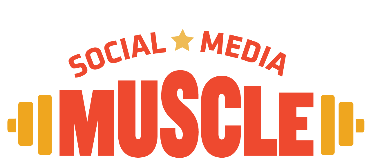
Brief from client
Design a logo for a social media marketing business targeted to health and fitness professionals.
Design a logo for a social media marketing business targeted to health and fitness professionals.
12 Comments
I like the idea, the symbol is simple and I get what you're saying. Something doesn't quite work for me with how you scaled the letters in muscle. I get that you're making a bicep-like muscle bulge, but it's really distracting that you have the S as the largest even though the S is not in the middle. The M & E should be the same, then the U & L should be a little larger and the same and lastly the S & C should be the largest, but the same size as each other. Right now it looks so imbalanced and off-center. The colors might just be my own preference coming in, but when I think of social media there is a lot of blue and red, but I definitely don't think orange and yellow. Now if you were trying to STAND OUT from the rest of social media then maybe this will work, but the name makes me think that this company has great knowledge and influence in the social media world, and that would make me think that the colors should actually FOLLOW the trends right now in social media icons and brands. Just my thoughts.
Totally helpful critique, thank you!!! I actually considered mimicking current social media colors too. I started out with FB-like blue, as in this image. But then I thought I didn't want it to blend in with the rest. But I guess I needed to hear that view point. And YES, thank you for the suggestions regarding the muscle bulge....I was in such a quandary over that. I will adjust the kerning, tracking, arch and create some more air between the wordmark and the text above. Thanks again!
I really dig this logo. Maybe put a bit more space between the word mark and the text above, so the composition breath a little more.
The upper text is weird looking. The two words don't follow the same curve. Since the "social" is longer than "media", you need to adapt the tracking.
Also, you need to fix that kerning. The logo will be even better.
Good job!
Thank you! I needed to hear that. Sometimes you just develop tunnel vision looking at your own design over and over. Totally appreciate the feedback.
I think that if the word muscle followed the same arc, it would look more natural and more like muscle.
Interesting idea.
I will try that! Thank you!
ooooh NOW I know what you mean. I tried arching the baseline, you mean to suggest that I align the upper part of the word mark's arched letters with the text above. I'll try again and see what happens.
Following the upper text curve.
That is already looking better!
I sort of had this in mind. it is hard to explain, I will show!
Yup! I feel you, thanks!!
I like the idea, apart from what has already been said above must adjust the kerning in the word muscle.
Thank you so much for taking the time!