Social Media Muscle
lytlgrl | Tue, 09/15/2015 - 04:33
Brief from client
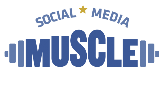
Logo for social media client who specializes in working with health and fitness professionals.

I wanted to steer clear of any actual graphic depiction of muscle. These colors were my first choice but I was afraid of it being too bland for the business name. Thanks to critique feedback, that idea garnered support. So what you see here is an image reflecting those helpful adjustment ideas.
Also, for some reason, even with the bottom of the letters grid aligned, my eye goes crazy because they don't seem to align. Additionally, I tried the idea of curving the word mark as in the text above, but I couldn't get it to work. Again, many thanks.


6 Comments
Much better in my opinion! Only small thing I see is that there appears to be more space between the E and the weights than there is space between the M and the weights. I personally dislike stars in logos and think they look dated, but they're starting to come back some so that's just my own preference. I like it overall :)
Thank you SO much, your comments were SUPER helpful! And yes, I'll adjust that weight! LOL
The reason your eye goes crazy is because curved letters like O,S,C etc usually fall below the base line and above the cap line (see attachment). Working with fonts, aligning, kerning, stuff like that is a lot more visual intuition rather than exact alignment. You will especially notice this trying to center align a font like Futura, trust your gut not the program, like here your eye is right the align function is wrong.
Now about the logo, I'm not a fan (but I seem to be in the minority). To my eye the current version is too static, the varied heights of the letters are too stair step, not fluid enough. If you are going to use the weights look at some reference, keep them simple but more accurate, think infographic style Social media is a very up to the minute industry and your logo needs to reflect that. Like I said I'm in the minority, so take it for what it is, just an opinion. I'm breaking one of the unwritten rules here but I wanted to show you what I am trying to express about the logo needing to be more dynamic. Look forward to seeing more from you.
Oh yeah, like that. Refer to this! :D
i'm with fredrg on this, I don't love the logo. But several other do, The arc sample here looks much better, but probably looses the barbel aspect of the design.
Arrgh,now I'm torn. I totally see what you mean. And I see the error of my ways. Thanks so much for your feedback! By the way, the typeface is Knockout Ultrawelterweight. :-)