SOFI Burger
Bunkerads28@gma... | Mon, 10/21/2013 - 19:21
Brief from client
Client needs a semi complex logo for his hamburger business, wants to name it sofi (for sophie, the name of his daughter...you know...) burger, I'd really like you guys to tell me if you think it's gonna work, Thank you!!
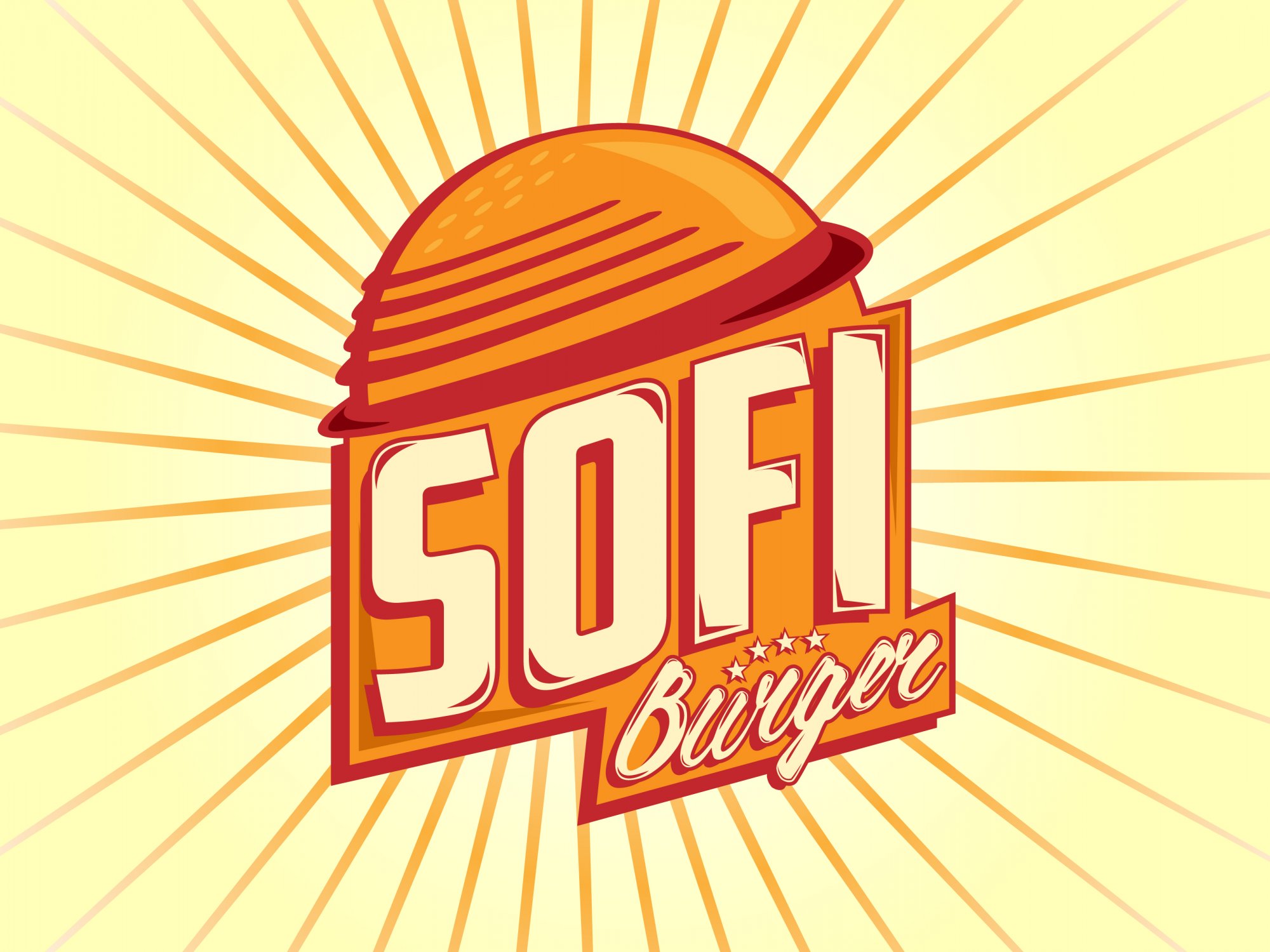
Client needs a semi complex logo for his hamburger business, wants to name it sofi (for sophie, the name of his daughter...you know...) burger, I'd really like you guys to tell me if you think it's gonna work, Thank you!!
10 Comments
The bun looks like a helmet.
Thank you, maybe taking out the red lines...
I would make the SOFI softer since it represents his daughter. For critique purposes i would upload without the background elements. Bun does resemble Hat.
Thank you for the comment, maybe they could use it as a "bun shaped hat" in the restaurant
The bun looks kind of planetary to me like the burgers are out of this world. In general, I really like it. It has a nice visual pop to it. It also has a bit of a retro vibe to it that I like.
Yeah the retro vibe was the intention from the beggining, thank you so much for your comments
I thought this was some sort of planet / space themed design before reading what it was for. I love the direction though. It has hints of a very retro looking burger joint branding. Just tighten up text a bit. Try a variation with 'Burger' under SOFI. Also agree with above saying upload (for critique purposes) without b/g elements included.
I do like the direction!
Keep tweaking.
I like where this is going, but you're not quiet there yet.
I do agree with comments saying that the bun looks like a planet or a helmet.
I'm not a fan of having a wiggling bold condensed font stuck in an exiguous space.
The subtext is hard to read and the stars don't really make sense, at least to me, and complicate things.
Globally, this is way too cramped. It needs to be loosen up a bit and breath.
I'm not a fan of the color. I get that you went for a vintage style, but these shades of orange just look too dated to me and make the whole thing look like it's a cheap burger joint somewhere in Arizona =)
Good luck.
Thank you for the comments! It do is a cheap joint but in mexico haha!
I´ll do some corrections and upload it later, you've been so helpful.
ok