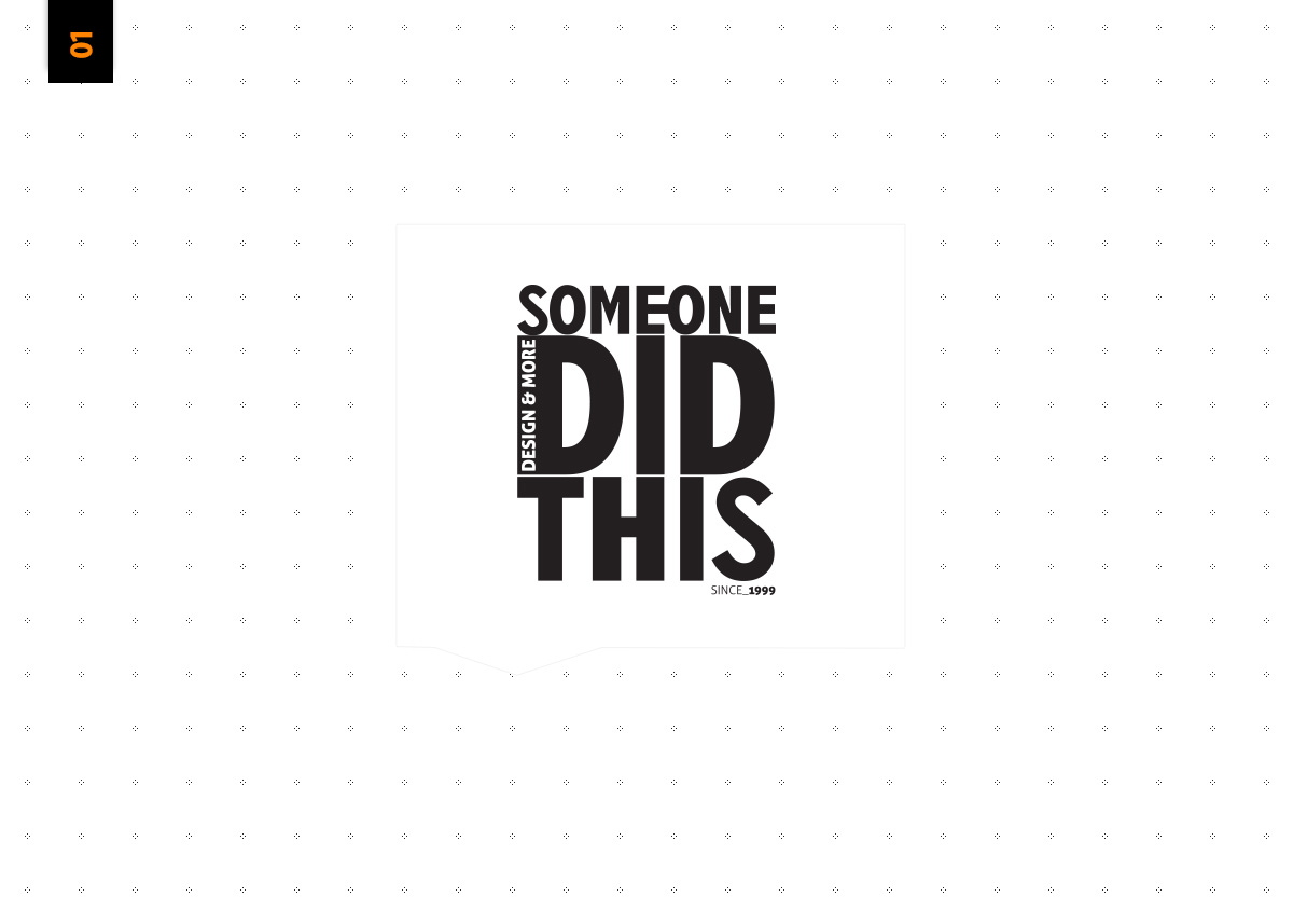
Someone Did This
decydecy | Wed, 01/09/2013 - 11:53
Brief from client
i'm the client !
I wanted to have a logo without symbols / icon...cause they may get old, become untrendy.
I wanted to be strong and bold but not too loud cause i'm anonymous
Simplicity, balanced, basic colors this all relates with my values.
5 Comments
Is really good, the "Design & More" is too small, maybe it fit good like a subtext
Something like this, I think it works
I feel like now where "design & more" now sits, it doesn't group very well with Someone Did This (gestalt grouping). It is now is an outlier. Perhaps finding a way to incorporate some depth into z space might in itself portray an obvious amount of "design" rendering it redundant to have it spelled out in more lettering... perhaps?
I would loosen up the whole thing a bit. It's way too tight.
I would change the font. This one looks blend but also a bit weird. This H is way too fat compared to the other characters.
And the subtext doesn't look good where you put it. Keep it simple, like Virgilio showed it to you.
I'd also remove the "since 1999". It can work on a vintage style logo, but I don't think it brings anything useful here. It also makes the logo slightly uneven.
I actually disagree with the posters above. Personally, I love the tightness of it. It feels a little wacky and zany. Which is what creative design is all about.
To me, it feels like a guy/girl whos willing to take creative chances. The name is already poignant and novel "Someone, did this" it could read alternatively. Maybe adding a comma is whats throwing everyone off.
Maybe play with exaggerating the difference in your font weights, so it feels more intentional. But right now it very much reminds me of the title/logo for "Despicable Me". Could also play with the slightest of slight rotations on some of the lettering to add that ungrounded creative feel to it.
Perhaps even overlap "SOMEONE" in between DID and THIS. Make it feel like "someone" is in the foreground resting on top of Did and This. Might be cool.