Brands of the World is the largest free library of downloadable vector logos, and a logo critique community. Search and download vector logos in AI, EPS, PDF, SVG, and CDR formats. If you have a logo that is not yet present in the library, we urge you to upload it. Thank you for your participation.
soundstar
carlgoldson | Mon, 08/06/2012 - 16:50
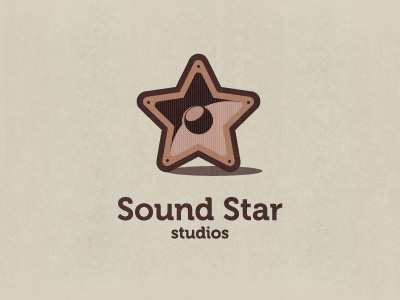
Brief from client
the company is called sound star. An urban music agency
I guess this works okay... But why such boring/muted colors!? I mean not to be grody or anything, but it's a star... and it's brown... Get my drift? Hehe....
I might switch the font to something slightly more exciting, and definitely the colors. Right now it's just so drab! But the symbol looks like it was carefully done and everything, I just can't get past the colors! Maybe just try to spice it up a little!?!
thanks for the feedback, but being the customers colour choice and the fact they want a star this is the best i can do colour wise.. this is an urban company as per description. these are the urban colours the customer picked.
as for the "it's a star... its brown.... get my drift...." are you saying all stars that are ever used in designs are only that tacky gold - yellow colour?
the design needs to be urban, grunge and sarah... yellow really wouldn't work... get my drift?
u did a really good job, the coulours are simple and set the logo in a chilldout mood. Think the Font is good 2, but maybe try something older like the persil slogan from teh 70´s
Hehe. No, no, no. I wasn't talking about changing it to yellow... I was... Well, maybe it's an American thing! (We call a certain body part a 'brown star' sometimes.)
I wasn't trying to be unkind, just trying to give my honest feedback! Hope it didn't ruffle your feathers- that's what we're here for after all!
hahah you haven't ruffled my feathers.. I uploaded exactly for that, great constructive feedback.. all i am doing is explaining how i have been restricted colour wise. and lol at the body part ;)
i really like it and like You've said i think the colours work well to give it that urban feel, maybe the font could be a slightly more urban style to match
I like what i see here, only issues i see the lines on the inside of the star might fill in when shrunk.
I think the colors work if those are your clients colors,
I think steel gray and black is more urban than brown that has an almost pink feel to it. Very cool Speaker Star idea, though almost all speakers are gray and black. Couldn't you make the type a graffiti font or have an air brush feel? or is that too cliche urban? the word studio I feel is too small. My .02 cents :-)
I really like it, but it seams a bit complex, too many elements, try a simpler version...also the shadow underneath the star doesn't really fit in the design. Looking foreword for a new version...p.s. keep the colors, we're not all americans (:
14 Comments
I guess this works okay... But why such boring/muted colors!? I mean not to be grody or anything, but it's a star... and it's brown... Get my drift? Hehe....
I might switch the font to something slightly more exciting, and definitely the colors. Right now it's just so drab! But the symbol looks like it was carefully done and everything, I just can't get past the colors! Maybe just try to spice it up a little!?!
thanks for the feedback, but being the customers colour choice and the fact they want a star this is the best i can do colour wise.. this is an urban company as per description. these are the urban colours the customer picked.
as for the "it's a star... its brown.... get my drift...." are you saying all stars that are ever used in designs are only that tacky gold - yellow colour?
the design needs to be urban, grunge and sarah... yellow really wouldn't work... get my drift?
u did a really good job, the coulours are simple and set the logo in a chilldout mood. Think the Font is good 2, but maybe try something older like the persil slogan from teh 70´s
Bye
I agree. It's great, but the colors.
Hehe. No, no, no. I wasn't talking about changing it to yellow... I was... Well, maybe it's an American thing! (We call a certain body part a 'brown star' sometimes.)
I wasn't trying to be unkind, just trying to give my honest feedback! Hope it didn't ruffle your feathers- that's what we're here for after all!
hahah you haven't ruffled my feathers.. I uploaded exactly for that, great constructive feedback.. all i am doing is explaining how i have been restricted colour wise. and lol at the body part ;)
lol@certain body part
i really like it and like You've said i think the colours work well to give it that urban feel, maybe the font could be a slightly more urban style to match
I like what i see here, only issues i see the lines on the inside of the star might fill in when shrunk.
I think the colors work if those are your clients colors,
A+. I like it!!! Even the colors...
cheers guys.. =O
I'll join in, I like it. My feedback would just be a repetition of what M@ said. Good job!
I think steel gray and black is more urban than brown that has an almost pink feel to it. Very cool Speaker Star idea, though almost all speakers are gray and black. Couldn't you make the type a graffiti font or have an air brush feel? or is that too cliche urban? the word studio I feel is too small. My .02 cents :-)
I really like it, but it seams a bit complex, too many elements, try a simpler version...also the shadow underneath the star doesn't really fit in the design. Looking foreword for a new version...p.s. keep the colors, we're not all americans (: