Southern Motor Show
modifiedxtreme | Sun, 12/29/2013 - 23:32
Brief from client
Logo Designed stand out and be easily recognized for the UK Southern Motor Show
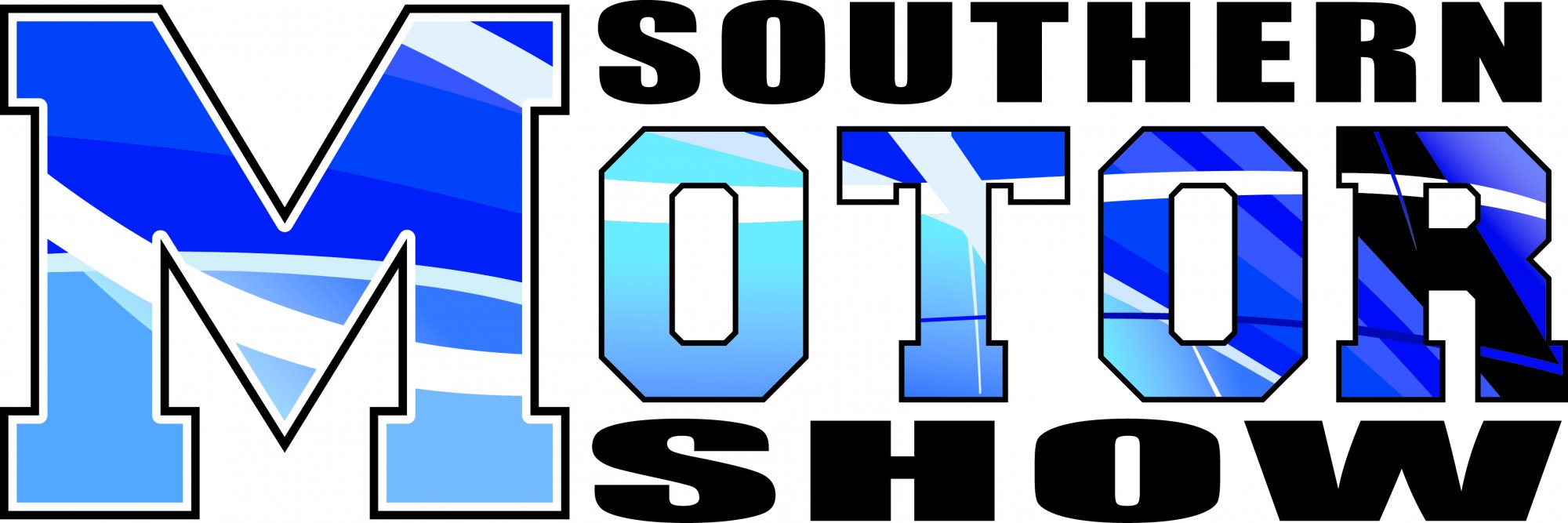
The Southern Motor Show
Logo Designed stand out and be easily recognized for the UK Southern Motor Show
The Southern Motor Show
4 Comments
I agree 100% with what Shanuea said.
Never squizz or stretch a font. It will always look terrible and amateurish.
One last thing: there's nothing in this logo, which is more of a word mark, by the way, that says "motor" or "UK". It's definitely not standing out and is not easily recognizable.
Good luck!
SORRY BRO, THIS DONT WORK IN ALL
You have just two typo but looks like 4 because you make many changes in them. You need to remove all the gradients inside the fonts because not work in some merchandise products.
Good Luck and sorry for my bad english
Flair is never an appropriate substitute for substance. It looks like you spent more time on the colors and curves inside "Motor" than you did on anything else and that area is the most detracting thing about this. Scrub all the fluff and get back to paper. Try coming up with something that has a good solid foundation and a clearly communicated purpose before you vectorize and add color. Best of luck to you.
Why are you over emphasizing the "M"? I see where you are going with the fill on the letters, id bet your trying to show a highlight of a car. It would work if that is what you did. Try that instead.