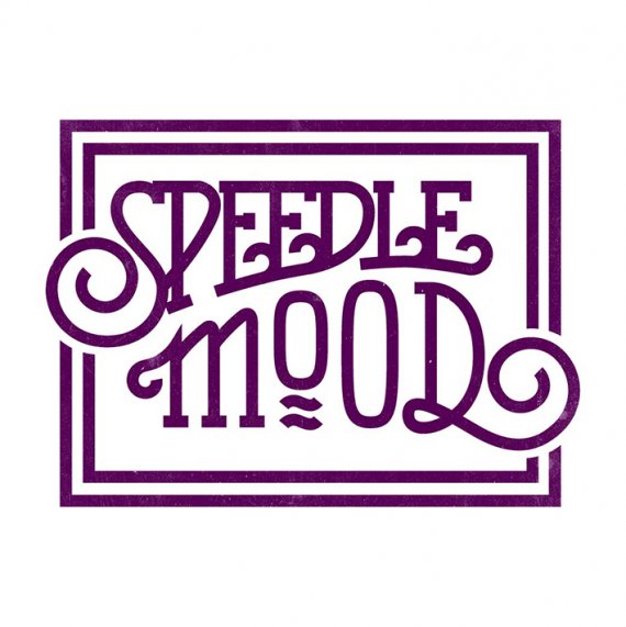
Speedle Mood
Shawali | Fri, 08/28/2015 - 19:47
Brief from client
Hi guys and girls.
I'm playing in this band called Speedle Mood, and I get to create our logo.
Those who know me know that of course I'll go full hand -lettering =)
To give you a bit of context, we play covers going from Guns 'n Roses to Portishead, via Johnny Cash and Mumford & Sons.
Tell me what you guys think!


8 Comments
I like this change.
Good job!
all combines good job very well
It's particularly purp-tacular!
The kerning is all over the place... compare it to version 1..
I think you nailed this one, it reads how it is supposed to.
Just real clean vector look that I like.
Did you start with a font or did you just make it all yourself?
Thanks! I didn't use any existing font. I drew a few dozen sketches until I got one I was happy with enough to digitalize it. From then, it's all about laying down strokes and spending hours fine tuning the Bézier curves.
I am a bigger fan of the first version, i don't know your process but I'd say you have over thought your design. The first version had a nice compactness to it, every stroke looked like it belonged there. The mod to the Os in the second version was nice but the words started to space out a bit, by the time you got here MOOD looks even more separated almost like you forced it to fit in place of a longer word. With SPEEDLE, adding the extra loops to the E and L interupts the flow of the lettering to my eye and i don't think it is needed for readability, unless you really need to aim for the lowest common denominator. Your first version reminded me of when Clapton was God, this one not so much.
I really like it but your kerning still bothers me! "mood" is nicely spaced out, perhaps a tiny bit too spaced out actually and "speedle" has the letters touching/too close together. i think you need to tweak but words and make them even. Good job on the "L" now though.