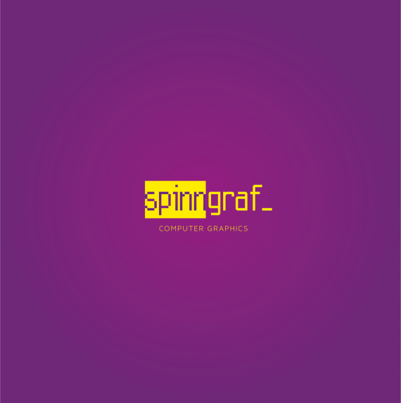
SpinGraph
Brief from client
The logic of this logo is the one that every graphic designer follows when he sits down on the computer and starts to build the idea. So you put some text, select it, edit it, and represent it in the best way, as more correctly, functional and esthetically possible. . From here , as graphic designer, the idea of my logo .
Spinn isn't just put in an ordinary rectangle but in a selected text space (try doing this at home :P) showing the transition from one character to another(from the DOS language to a contemporary one) from spin to Graf, intending a long experience and professionalism.
The bottom line in this case indicates that the main text is not only a simple logotype, but a continuous editable text, specifying that it is selected and not just put in a regular box.
Hope i made myself clear :)


1 Comments
Sorry, I'm not really into this one too much. I looks more towards something that could be used for a programming company, but then it still doesn't look modern enough to be a serious programming company.
Could of played on the spin idea to find some way to give an icon motion. Something subtle would work well.
Is there a reason for the word "graf_"? And also, Using the tagline "Computer graphics" is this for a graphic design company? Using the word computer graphics, there should be some form of a graphic/illustration/icon.
Have you tried out any other concepts?