Brands of the World is the largest free library of downloadable vector logos, and a logo critique community. Search and download vector logos in AI, EPS, PDF, SVG, and CDR formats. If you have a logo that is not yet present in the library, we urge you to upload it. Thank you for your participation.
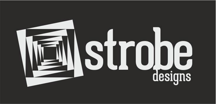
I love the design element, it's eye-catching and works well in black and white. I like the font use, but the kerning is slightly off. Because of the larger negative space created between the t and r and between the r and o, you need a little more space between the o, b, and e. Not a lot though! Also, bring the "designs" down slightly so the d isn't touching the b.
I think this actually kinda works! The only thing I'd definitely change is the subtext- it shouldn't be touching the main text!! (And would you consider changing 'design' to all caps and then spacing it out across the bottom of "strobe"?? Then that whole two-line chunk could be more center aligned with the symbol!?)
3 Comments
I love the design element, it's eye-catching and works well in black and white. I like the font use, but the kerning is slightly off. Because of the larger negative space created between the t and r and between the r and o, you need a little more space between the o, b, and e. Not a lot though! Also, bring the "designs" down slightly so the d isn't touching the b.
"designs" was separated when i saved it o.O I need to learn some things about typography, thanks for the tip :)
I think this actually kinda works! The only thing I'd definitely change is the subtext- it shouldn't be touching the main text!! (And would you consider changing 'design' to all caps and then spacing it out across the bottom of "strobe"?? Then that whole two-line chunk could be more center aligned with the symbol!?)