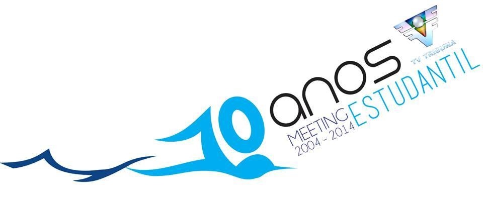
Student Swimming Championship of Brazil
lucasmusumeci | Tue, 02/11/2014 - 03:00
Brief from client
The same logo of Student Swimming Championship of Brazil with another color... Made in corel draw
OBS: I AM AMATURE
The same logo of Student Swimming Championship of Brazil with another color... Made in corel draw
OBS: I AM AMATURE
4 Comments
Sorry, better pass the job to an expert, or if this is not an option ... I have some advice for you.
1. If you have a logo above, it is necessary to review the rule book because it is very uncommon for a logo can be rotated.
2. The existing logo must be legible, I would recommend you something more linear, something like the example, if it is for a television, I recommend something in a circle, and you do not want to fill the screen.
3. The water lines are fine, just quetienen different thicknesses and that makes not look good.
4. 10 modify it is unreadable.
5. Part of meeting this fine student.
Generally have a good idea of what to do, just has jumped rules that are very important to not spoil the image of a company or brand.
Regards and good luck. And excuse my bad English
thank you for your opinion and the tip you gave me, this logo is a student Swimming Championships which will be televised on "tribuna tv" which is the colorful mini logo on the right, thank you for the comments
To many fonts
whats that thing at the right top?
to many colours
.....Improve it and try to make it easier
thank you for your opinion and the tip you gave me, this logo is a student Swimming Championships which will be televised on "tribune tv" which is the colorful mini logo on the right, thank you for the comments