Studio Grave
C.Silva | Sat, 10/27/2012 - 13:01
Brief from client
Studio Grave
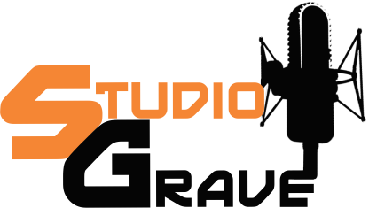
First of all I am not a professional design, have more design as roby ... These logos posted here, can work without expression and even amateurs as I spoke here, but are made with much ease. And that I have a lot to learn! So much so that redid all and I put them here to be criticized again, with the criticisms of you have learned the art of a logo has to be simple and the simpler the better ... So redid this and posted here again, I removed all excess and let simpler. The colors kept because the guy who just asked me to ask exactly those colors ...
3 Comments
I am loving the color scheme! And I think your font can do pretty well
However If it was up to me, I would smite your microphone, it's simply looks like you just pasted it in there you know?
Hmmmm well since you have an "I" there, why not just make that into a microphone? That was you incorporate your symbol into the text, it looks more simple, and it can be viewable in small sizes. If you're going that route I suggest going for a more recognizable microphone than what you have here.
More recognizable mikes:
http://www.zzounds.com/item--RODNTK
Probably go with this one VVVVVVVVVVV
https://encrypted-tbn0.gstatic.com/images?q=tbn:ANd9GcTroR0BebFihjvT8SC5...
I hope to see more versions of this, keep working on it :D
Get rid of these horrible big ass caps. Don't complicated things.
Find a simpler mic.
If you're stuck with the colors, then I guess you're stuck with the colors. It screams Halloween to me.
The font- I would STILL recommend changing the font. I don't like it here and I haven't liked it in the other versions either. Same with the microphone- it's too detailed, too many edges- make a more simple one.
I don't mean to come off as a bitch, but it seems like you're kind of just re-arranging the same not-great elements and uploading 'new versions'. I'm glad to see you've finally ditched the sound wave element, but pleaaaaaase listen about the different microphone!! And try a different font- and probably not a script font like the other version that you uploaded more recently.