Submarine Sky
Costantino Rover | Sat, 03/14/2015 - 19:42
Brief from client
This is the logo i concept for comics stripes and cartoon I making since 2011 based on surf and snowboard sport.
"Submarine Sky" is the title of the project
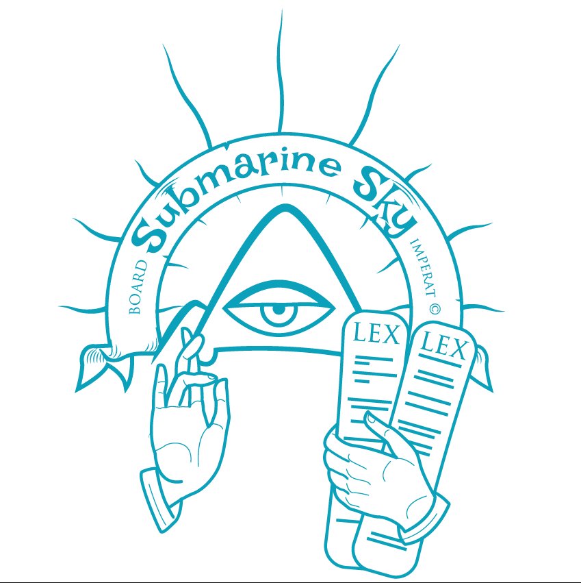
I wanted an origina logo designed mixing sport comic style and russian religious icons.
So I decided to use biblic subjects like the triangle of trinity that becomes a mountain, the laws tables that becames snowboards etc.
5 Comments
Roger, I will be as constructive as I can without sounding harsh. As far as logos go, this is way too detailed. From the lines in the hands, the fingernails, the shadow lines on the ribbon and even the sun "ray" lines. Simple is much better when it comes to logo design. I don't see the "mountain" in the trinity, nor do I see "snowboards" in the tablets. Without your explanation, I wouldn't understand a single thing about this. I don't know what LEX means and I wouldn't know what this company is from the title, Submarine Sky. For all I know, you make submarine sandwiches and your tablets resemble the bread more than snowboards. I'm afraid there is too much wrong with this and very little right as a logo. If I were you, I'd start over from scratch.
Did you design the whole thing yourself, incuding the gands and the ribbon or they vector files you picked up the internet?
Nothing downloaded. I drawed everything.
Illuminati Confirmed.
This is about 4 logos jammed into one space.
It would be a good image where it could be all there and not needing to be recognized quickly, for example watermarked on overly complicated and secretive stationery.
Otherwise you need to pick one element, and focus on that! Providing of course you created it. :)
Also, ditch the arc text. It is not doing you any favours.
Finally, get rid of words that are not part of the logo. It looks like this company is called Board Submarine Sky Imperat Lex Lex.