Sumawo
anxian2002 | Tue, 11/06/2012 - 04:37
Brief from client
Sumawo, is a company who provide catering service , the major cuisine is japanese sushi ,but they do provide other cuisine like chinese or western cuisine and for the catering.
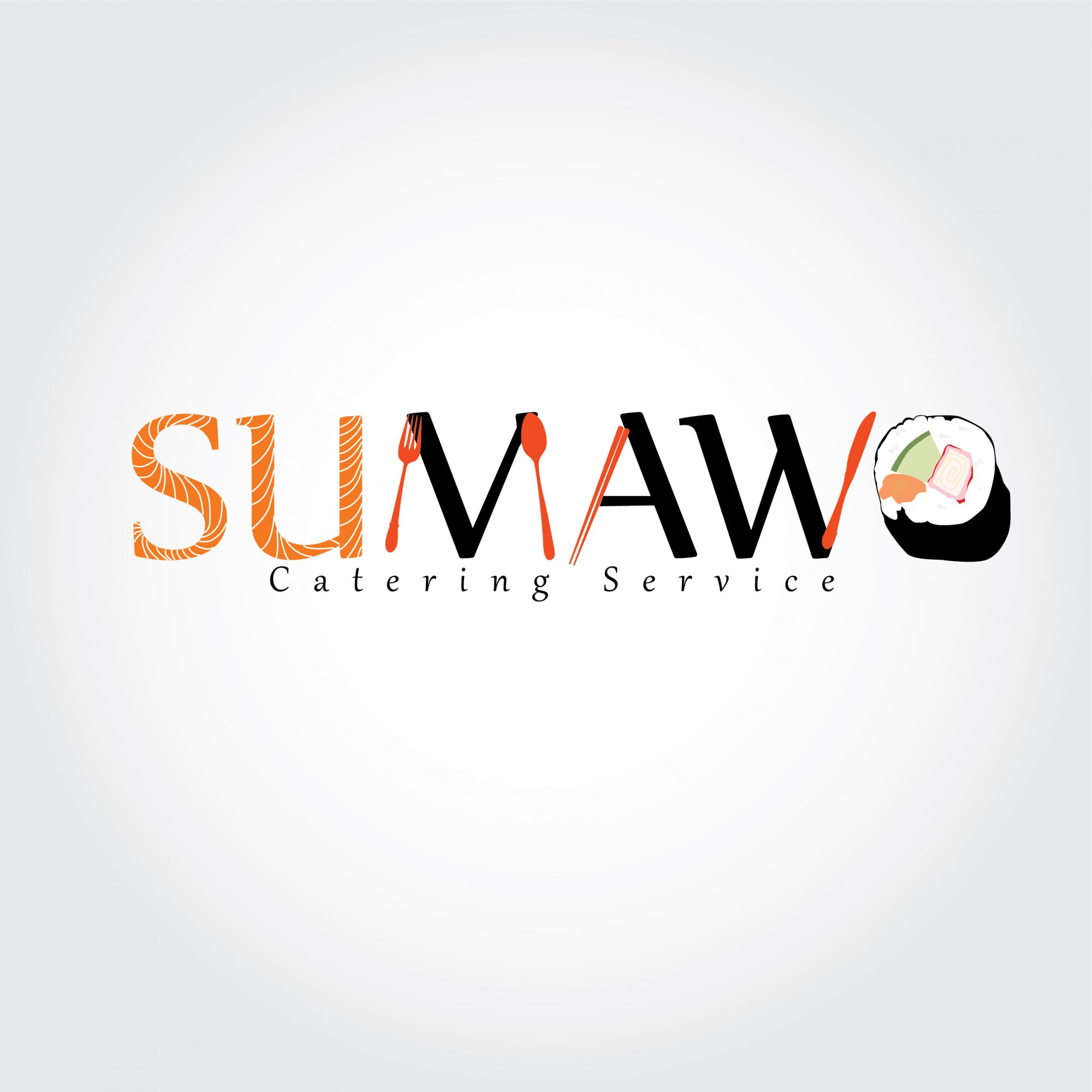
The concept , i symbolized the logo with the sashimi and adding some of the element of other cuisine, like fork and spoon , and the chopstick to emphasize chinese cuisine.But after all of course, the major is the japanese cuisine.
Fo the color , Sumawo is owned by a ground of young peoples, so i used the orange color for the logo , to represent the passion, energitic, creative to show what Sumawo is .
3 Comments
Way too complicated and literal.
Yes, far too complicated, SO many elements going on:
-We have the SU looking like fish (which, as I'll get to in a minute- I actually like)
-We have the MAW being made partially out of silverware.
-And then we have the O being made out of a sushi roll... (And by the way, I didn't even realize that the name of the place ended in an 'o'- I thought it was just a chunk of sushi hanging out at the end of "Sumaw" - which is what I thought the name of the place was.)
All of this together is just a headache waiting to happen. You clearly had a vision going into this, but I think you just had one too many ideas and decided to apply ALL of them instead of picking the best one.
My suggestions, if you're interested:
-Remove the silverware, replace with regular letters
-Remove the sushi, replace with a regular O
-Change the subtext- make it larger, make it NOT italic (is it italic? It looks italic!), and probably make it a sans serif. Also, move the subtext down a little- it's practically shoving itself up the rear end of the main text!
-All that said, now you'd have just regular type with better (in my opinion) subtext and no clip art.
This brings me back to what I said above about liking the raw fish letters- I think you might be onto something there.
How about applying that ONE thing (raw fish type treatment) to all of the letters and seeing where you stand. I think it could possibly look nice, simple, cohesive. And think about it- most of the best sushi on this planet is just that: simple! Perhaps your design should/could reflect this!?
Sorry to be SO damn wordy, but I really hope I get to see a 'raw fish only' version- with some nicer subtext thrown in to boot!
As been said, too much going on. So much so that when I look at it I only read the word "SAW". I do like the salmon texture on the "SU" but the utensils, black solids and roll don't work for me.