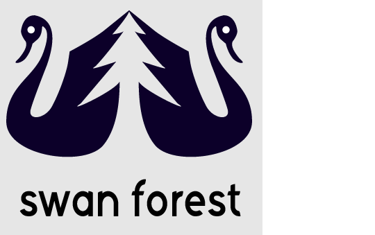
swanforest with kelvetica regular
tasrubabu | Mon, 10/20/2014 - 03:52
Brief from client
i again post my logo because of many suggession that my logo font should be changed. my friend radicalevel suggest me to use helvetica. now i use kelvetica regular that is a member of helvetica family.
9 Comments
Kelvetica has nothing to do with Helvetica. It doesn't even look like it.
That being said, even though it's for from being top notch, it works better than version 1. You just need to fix the kerning.
thank u sir . i will kern soon. can u provide me some link about font family?
http://lmgtfy.com/?q=Helvetica+font+family
thanks friend for your help.
Looking at your last post, your symbol looks like the body of a swan and the head of a duck. When I think swan, I think elegant, graceful, organic lines. This has a very pronounced bill, like a duck. The body is good, work on the head a bit to really get that swan point across. Do some research on swan logos and you will see a difference. Maybe a curve in the wing also instead of the sharp point it's creating now. That should give you a nice contrast between a really curvy, flowing swan and a sharp-pointed tree.
That typeface looks like it has some consistency issues with the stroke. The lowercase "s" looks like it has a fatter stroke than the lowercase "f." Change it to actual helvetica and it will look better.
thanks for your nice comment . i will try to do what you said. wish u wiil stay with me in next logos.
The eyes are unsettling. I'd recommend probably just removing the eyes (or making them smaller), making the swan's neck thinner towards the top, and making the swan's beak less curved.
thanks for your nice comment . i will try to do what you said. wish u will stay with me in next logos.
I really like the idea behind the symbol, however in this version it looks way too forced. I agree with what heymie15 said on trying to making it look more elegant, and using organic lines. Besides that I would recommend you to re-create the logo from scratch, but in other roundings and shapes. Good luck.