Sweet and Cute
gnss.lnrs | Wed, 02/27/2013 - 00:58
Brief from client
A logo that says that my cupcakes are cute, delicious and that they are intented to be gifts for both genders.
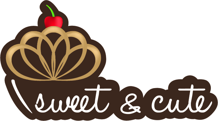
I created a cupcake using a bow so the word gifts comes to mind, and I tried not to use pink to appeal to the male customers,
2 Comments
I like the colors specially because there's no need to increase the power of the words 'sweet and cute' with pink. Like you did it, i like it.
Hi,
the first thing that i realised was the stroke infront of the sweet, it totally looks like an i. Maybe you better try something different!!!
Then the "crown" of the Cupcake, the colour gradient is not good for example, if u want to print shirts, and it doenst look like cream ore chocolat. You have to think about all that things,its important ;-)
Same with the Cherry ;-)