Brands of the World is the largest free library of downloadable vector logos, and a logo critique community. Search and download vector logos in AI, EPS, PDF, SVG, and CDR formats. If you have a logo that is not yet present in the library, we urge you to upload it. Thank you for your participation.
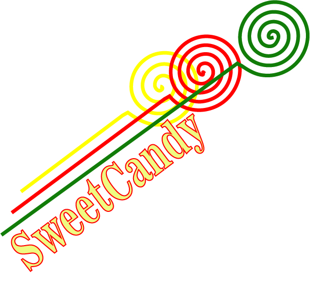
The choice of typeface is not "sweet", happy & young. The lollipops are not overlapped in consistent manner. Still, they are not nice even it is. The slanting doesn't make any sense, any reason?
This should be a lovely project and you have lots of opportunities to make this a fun logo. I would take my own *sweet* time to make a "slow" logo. Good luck.
The font and colour choice does not work. I do not see the idea behind the slanted type.
I would suggest you start over. You have to sketch a lot of ideas before you start.
2 Comments
The choice of typeface is not "sweet", happy & young. The lollipops are not overlapped in consistent manner. Still, they are not nice even it is. The slanting doesn't make any sense, any reason?
This should be a lovely project and you have lots of opportunities to make this a fun logo. I would take my own *sweet* time to make a "slow" logo. Good luck.
The font and colour choice does not work. I do not see the idea behind the slanted type.
I would suggest you start over. You have to sketch a lot of ideas before you start.