Tas Star Transport Pty Ltd.
schedio | Tue, 04/15/2014 - 04:09
Brief from client
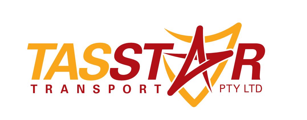
Logo Concept 1
Literally no brief. I know the client well from their last business. All the information provided was. "Hi mate, need a new logo for a merger business. It's called Tas Star Transport Pty Ltd."
As far as the colurs go it has to fit in with his tucks where the old logo will be removed and replaced with the new one. Black, Gold and Marone.
10 Comments
Here is the evolution of the design.
The idea is really good and works perfectly.
That being said, I don't really like the end result. First, I would have the symbol substitute for the A of "star". It's a bit too gimmicky for my taste. And since the idea is awesome, it doesn't need to me trapped between the T and the R. Let it breath so it shines even more. Maybe I'd try a different look for the star, less "hand drawn" and more solid and straight.
Also, not a fan of the color. Looks dated to me and it's probably just me, but I immediately think about spaghetti bolognese =) Bottom line is, it doesn't really say "trust" or "reliable", as you would expect from a transportation company.
I would add a space between "tas" and "star", so it doesn't read "tasstar".
Anyway, this is a great idea, you should keep working on it.
This is really good feedback thank you. Unfortunately I haven't got much movement with colours as it needs to be the same colours as their previous logo before it changed the name. I might try a grey instead of the red or yellow and just use the other colour in advertising and stationery branding.
The old company:
http://www.kellaratransport.com.au/
Thanks again for the feedback. I will make sure I upload a new idea based on it.
Seeing the old logo, I'd go for a dark burgundy red and ocre. Depending on the color of the background, have several options.
Great development work. As Shawali, it's not a great conclusion. I think the colours might be what's letting this down, but I would also experiment with the font.
Do you have any suggestions for fonts? I work on what works for my taste but it's great to hear other peoples,
I think what you have, isn't far off, it's just a bit generic looking at the moment.
Keep it Sans Serif and probably a tad bolder.
Have a look here - http://www.fontsquirrel.com/
and here - http://losttype.com/
or here if you're desperate - http://www.dafont.com/
Yeah I have all those sites bookmarked. Use Squirrel quite a bit.
I cannot stress enough to go on DaFont only is you're desperate and know what you are looking for. 90% of the stuff there is crappy fantasy font.
and when outlined, even the nicer fonts look live traced.