Teach me teh ways master yodas!
Westn | Wed, 01/02/2019 - 20:41
Brief from client
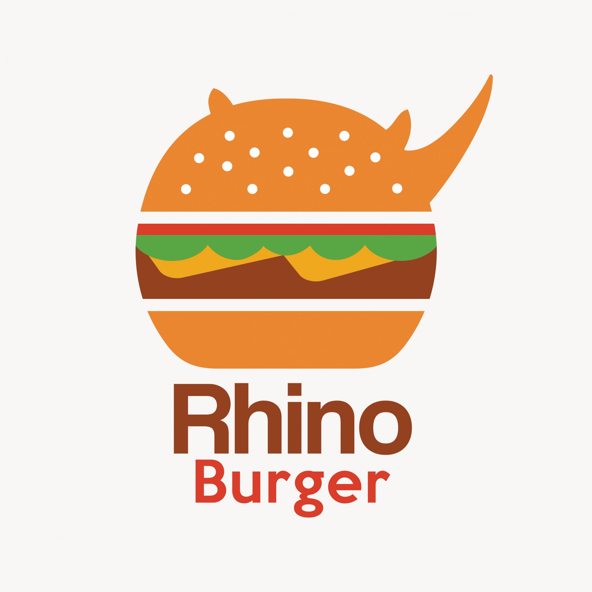
Rhino Burger
Hey guys, Happy New Years to all of you!
So im a newbie into the designing game, hoping to make this my profession one day! Im challenging myself to a 30 day logo challenge and today is day 1 'burger joint". Rhino Burger was randomly chosen on a word generator. I have no clue to what im doing and i would really appreciate any help or advice you guys can give me. Thank you in advance - Weston
6 Comments
I like your style kid ;)
All in all, not a bad shot for someone who claims to not know anything about this field of work. You seem to have a good eye for color and you can get creative.
our lovely Admin, Shwahili, will eventually pop in here with a giant paragraph of design tips that you should follow, so I'm not going to post them here just yet.
I'll give you these quick tips: Too many colors. A logo, in any case, should always be able to work in black and white. And I don't mean grayscale. I mean if your logo had to be all white, on a black background, it needs to be able to work. Narrow this down to 3 colors minimum.
Fonts: These fonts aren't a bad choice for the style you went with, but I think you can push it. My advice, if you haven't already done this, is to take a typography or type theory class. You'll learn about kerning, tracking, leading, etc. I say this, because your fonts need more contrast between the main word and the sub word, and the kerning on "burger" is wild right now.
Nice first start, now I want to see you push the concept further. Sketch and sketch and sketch until your hand hurts and you've come up with every insane, nonsense idea you can come up with.
Thank you for the kind words!
I’ve only taking a very entry level design class and recently got a gig at local sign shop, so I’d like to get a whole lot better at designing.
Thanks for the heads up on the typography class, had no idea course like that even existed, I will definitely look into it.
Thank you so much
"Shwahili" ? Is it your auto-correct playing tricks on you? ;)
Hi, Weston!
This is really good for someone just starting. You already had a pretty clear idea, and your graphic isn't bad. I like the use of clear-space.
Erin is right about having your logo work in black-and-white. The bun parts are pretty clearly defined, but the middle parts are cramped and have too many colors/elements. So many colors against each other with no space or outline means this would be difficult to convert to single color and keep legibility.
Logos can be really tricky. It has to be clear and simple, but also look aesthetically nice. Focus on pleasing patterns and shapes. Look at similar logos for inspiration, too. Your "Rhino" aspect, (although a very good idea!) doesn't stand out as much as it could, either. Ears are a bit small and rough looking, and the horn is very thin.
Typography and kerning is something I also struggle with. I would typically avoid using generic fonts such as Arial, Myriad Pro, and Helvetica. For a burger joint with the word "RHINO" in it, I'd suggest a solid sans serif. Maybe the ever popular Montserrat. You can find a lot of good fonts on Fontsquirrel.com.
Are you going to be posting your other logo challenge logos here? I'd really like to see them!
Hey Weston. I agree with the comments above: for a beginner, this logo is pretty good so far. I've seen way worse coming from so-called pros.
I don't necessarily agree that there are too many colours. It's usually recommended to stick to 2 colours, but in this case, I think it works pretty well. It's a burger after all ;) But Erin is right about the logo having to work in grayscale and black or white.
Here's the giant paragraph Erin was mentioning. It might not be super relevant if you ai at making a logo a day, but it'll give you valuable pointers anyway.
1) Research: don't just go into designing a logo willy-nilly. You got to know the lay of the land. Do a bit of market research before starting anything. In this case, a printing house, as far as I can make it out of your website. Look at what other print businesses have in terms of logos and brand identity. Do the same also for other business related to print, like agencies, freelance, etc. Identify the trends, see what works, what doesn't. More generally, build your graphic design culture. Know what you're dealing with.
2) Inspiration: simply get inspired as hell. Immerse yourself in great designs, may it be logos, websites, brochure, advertising, typography, experimental weird shits... You can start with these here sites: www.logopond.com www.fromupnorth.com www.dribbble.com www.fontsinuse.com. Also, get an Pinterest account.
3) Sketching the most important part. If your logo was Operation Overlord, sketching is all the beforehand preparations, the trial and errors, the planning, the restarting from scratch, until you get on that fucking beach and kick some Nazi asses. If you go straight at your logo without all that, you're in for a severe beating and less metaphorically, a crappy logo. Sketching is the most important part of the process, in the sense it's the best way to let ideas organically flow from your brain to paper by way of your pen. It'll take time, it'll be frustrating at times. But if you keep sketching on and on and on, something cool will come out. You just got to give it times. And sweat. But it'll be worth it. And beyond developing cool ideas, you will also develop your creative skills. It's an investment for your future.
Keep the logos coming, the more you make, the better you will become. Can't wait to see the evolution in the next 30 days!
See. Told you. Novel paragraph.