Tech Savvy Kids Club
ErinsSonicYouth | Thu, 07/06/2017 - 20:55
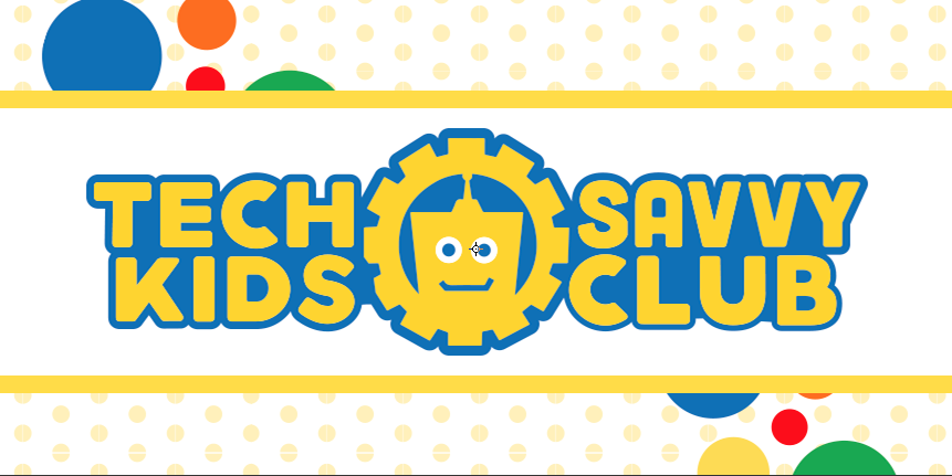
Brief from client
This was actually an update to an old logo that this company had.
They are a preschool and STEAM learning program that focuses on kids aged 3-12. They wanted to keep the integrity of the "lego head", while still having their own identity.
I'm attaching the old logo in the comments section.
6 Comments
Old logo
You have made some major improvements here. Good colors and much better type choice! Two things tho- 1) is that a "glimmer" you added to his eye or just picked up in your screenshot? If it's intentional, I say leave it out, it's not needed.
And 2) is all of your type the same size? I can't tell if it's the font, or if it's been lightly skewed? For instance, Savvy seems more narrow and closer letter spacing than Club below it.
Oh and one more thing, you are missing the corners on the 2 gears closest to Kids.
Overall tho, this is much more modern and yet still appealing to the age group, so good job. Just a few tweaks =)
That was unfortunately picked up in my screenshot, and I JUST noticed it after reading your comment. Its a selection graphic in photoshop.
Savvy is a bit more narrowed. This font had very, very, very wide V's, and it threw off the balance of the entire logo. We had to do the V's and even the A custom. I'm attaching an older version of this logo to illustrate the problem.
And thanks for pointing that out about the gears, that's a really easy fix with the white arrow tool.
<3
Ok- well I can't lie- the word savvy is still a bit bothersome for me. I also noticed the outline around Club is not the same thickness as the others.
I'm curious if Tech over Savvy (the older version) might actually read better??? I didn't have a problem reading it before, but some feedback from others on that may be something to consider.
As far as Savvy goes, I may just be picky about it. It's just the "odd man out" in this arrangement of text =/
Its extremely tough with that word in general, especially since it has 5 letters instead of four, like all the others.
The client, me, and my coworkers battled over legibility on that for weeks. I think either way works, it bothers some and not others.
One thing that would really help this I think is was if the symbol was in a different colour to the text. At the moment everything seems to merge into each other. It will help to make one part alone stand out and catch the eye rather that everything looking a bit flat.
Another note on your decoration.. Yellow on white isn't the best looking thing in the world so I would perhaps put a different colour behind the yellow or change the yellow to something else.
Definitely better than what they had before though!