Brands of the World is the largest free library of downloadable vector logos, and a logo critique community. Search and download vector logos in AI, EPS, PDF, SVG, and CDR formats. If you have a logo that is not yet present in the library, we urge you to upload it. Thank you for your participation.


11 Comments
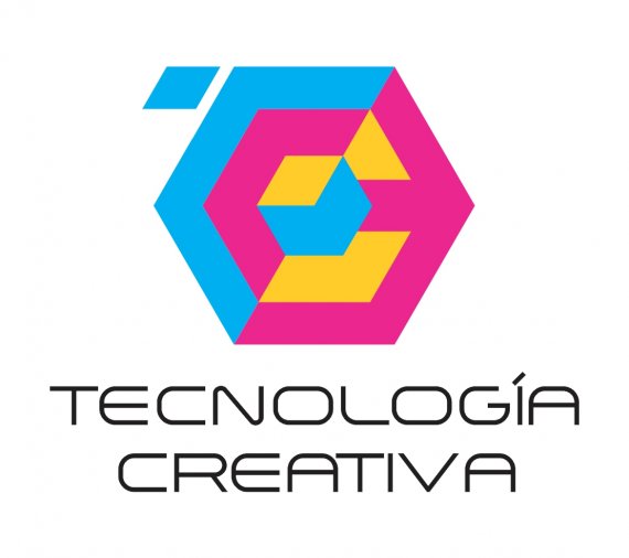
LIKE BUT NOT CONVINCE ME BECAUSE COLORS LEANING MORE TOWARDS PRINTING SYSTEMS
I WOULD LIKE TO RECEIVE YOUR REVIEWS AND CONSTRUCTION WORK THAT COULD IMPROVE. THANKS
LETS SCREAM TO EACH OTHER AND LET US DO IT IN SPANISH:
FUENTE QUE ES HORRIBLE!
THANK YOU for taking the time TO "COMMENT" ... BUT YOU COULD BE MORE SPECIFIC CRITICAL? ORDER TO IMPROVE WORK.
THANKS
For Pete's sake, please stop using all caps, it's very obnoxious.
Using pure cyan, magenta, or yellow is always a bad plan. Your yellow is a few shades off 100% Y, which makes it so much better than the other colours. If you made them all shades off it would actually be interesting.
I really don't understand the symbol. There is a C in there maybe, but otherwise divided Hexagons like this are a concept that are just used everywhere. They make your modern technology company feel the opposite of that.
hermano los colores te estan matando el logo
ta uma merda
Usa otros colores y otra tipografía y estarás más cerca de un buen diseño, en mi opinión no vas en mal camino, por lo menos es mucho mejor que el anterior.
(En cuanto a las mayúsculas: en serio deja de usarlas al comentar.)
Gracias por tomarse el tiempo para los comentarios, en verdad se agradece... seguiré trabajando en ello y pronto subiré la actualización, espero mejorarla
Saludos.
Google Translate lol
Thanks for the time to comment, really is appreciated ... I'll keep working on it and soon I'll upload the update, I hope better
Greetings.
The symbol is actually pretty cool, I wish I knew what it meant though. Nothing else works.
Please continue to update
http://www.brandsoftheworld.com/critique/tecnologia-creativa-1