Brands of the World is the largest free library of downloadable vector logos, and a logo critique community. Search and download vector logos in AI, EPS, PDF, SVG, and CDR formats. If you have a logo that is not yet present in the library, we urge you to upload it. Thank you for your participation.
Version history
Version 1

- I
- S
- T
- C


10 Comments
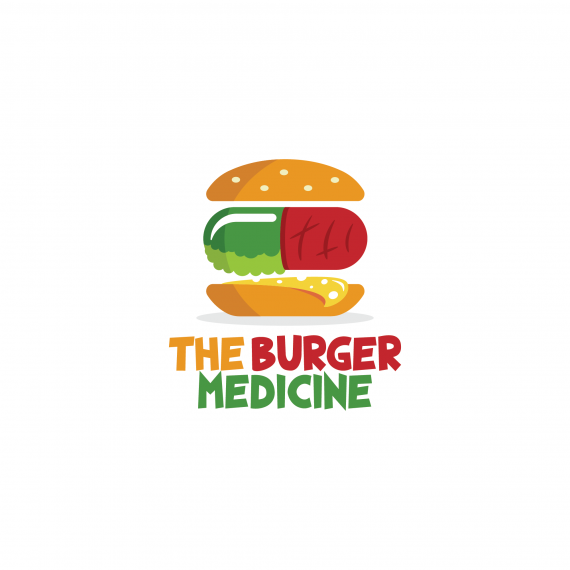
This one falls a bit short for me. The innards of the burger looks unappetizing. I understand the goal and what the imagery is supposed to be, but it looks like something is growing on the meat, and the cheese looks a bit slimy as well.
Good effort, though. Love the font!
Thank for your feedback! Much appreciated!!
It really helps, and i guess i will give up on the pill idea and replace it with something else.
It's really nice to hear someone else's opinions!!
Much appreciated!!
The "meat" of the burger is a major turnoff! The green especially- looks moldy or fizzy. And the red looks like raw meat! You have a great illustration style, but no one would eat this. NO ONE! (if they did, they would certainly need the medicine afterwards HA!!!)
:) Joy thank you for the joke and the feedback.
This is really helpful. I guess i will give up on this pill idea and replace it with something else!
Thank you again for your feedback! Much appreciated!!
I like this! But if you wanna go with the pill idea, you could just draw a pill that has the burger colors you used inside... idk, it just came to my mind.
Thank you! I used 3 color tones just because i felt a single blue would make it look too blunt. Also i wanted to make obvious the 3 parts of the lung.
I did that, but it looked too weird. I felt like the logo was providing the idea of literally eating pills. So yeah ... :) i hope you get it :)
Great logo, but I'm confused about the product or service it is representing.
The Idea is interesting. I think the problem is the complexity of the illustration. Simplifying the style may go along way in communicating without grossing people out. Holes and curves on the cheese, seeds on the bun, grill marks going two different direction are all a bit over the top. You have a strong idea found in blending the two items, so get to the point and let the concept carry the design instead of the illustration. The type is set well but without knowing more about the project it seems a bit to childish to be medicine related.
Thank you so much for you feedback. It's much appreciated!