The Charlotte House Hunter Group
Brief from client
We are a hip, tech-savvy real estate firm specializing in residential real estate in Charlotte North Carolina.
#1 - High Class
#2 - Modern
#3 - Smart
Age: 30-45.
Sex: Women most often initiate the home search process however not too feminine that it turns off men.
Location: Charlotte North Carolina
Occupation: Professional Services, Financial Services, Business owners,
Education: College Degree - Advanced Degree (Masters, MBA).
Interests: Technology, Reading, Music
Lifestyle: Status symbol, wanting more, improvement
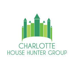
Charlotte is known as the Queen City" and the official logo of Charlotte is a crown. A artistic crown would make a good icon (instead of a house)
Also, our skyline is fairly unique featuring some iconic buildings. Our current logo features a very strict rendered skyline and, while we don't mind the skyline, we would prefer of an more artists rendition of the skyline instead of such a strictly rendered version.
6 Comments
Couldn't be more refined. Lovely work but the typography is way too "sans". Better use a combination of typographic styles. Keep up the good work,
amazing work .. really well done
Good work
I think the text should be somewhat bigger.
The symbol is too tall for a crown, if you don't write it in the brief I'd never guess what it is. The text is too close to the symbol. The "Charlotte" and the rest of the text could use bigger contrast in size. The roofs of the houses are sitting too close to the rectangles below them.
Totally agree with sensed. To resemble a crown the verticals should be shorter, with the tallest centered. Type can be refined - Charlotte bigger.Let's see it again!