Brands of the World is the largest free library of downloadable vector logos, and a logo critique community. Search and download vector logos in AI, EPS, PDF, SVG, and CDR formats. If you have a logo that is not yet present in the library, we urge you to upload it. Thank you for your participation.
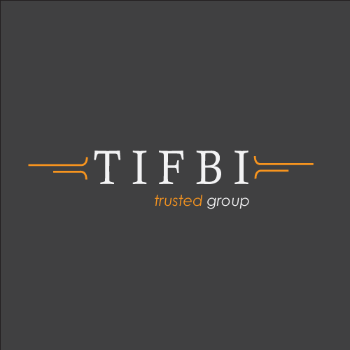
The Institute for Business Impact
webhunter | Wed, 06/27/2012 - 21:00
Brief from client
The Institute for Business Impact
or: TIFBI
company helps people achieve their goal in their career.
whnats to give the feeling of trust.
It's not really customary to include the article with the company's abbreviation. Is there a version that includes the company name with the abbreviation? Using just "IBI" would be a stronger reference. The tag line is a little too self promoting. If somebody says "we're a trusted group", I would immediately think the opposite. Aside from the content issues, this sample looks okay, but doesn't have a punch to it. It looks more like a word jumble puzzle than a company identity. It's a little mediocre and doesn't convey a strong company even though the word "Impact" is in the company name.
I think that the individual elements work, but not really together. I agree with the above that the statements and that 'trusted group' is ironically working against the idea that this might very well be a trusted group. It's a bit pretentious as a result.
You definitely want to remove the T and F from the above acronym. Media said it correctly. It's customary NOT to use articles such as The, In, For, etc within an acronym and the "IBI will have more impact if designed correctly.
ohhhhh the company name is registered as TIFBI? Gotcha.... I guess your hands are tied then. Maybe there is a way to make it NOT look like an acronym then? GOOD LUCK!!
Looks like a bank to me - ok, maybe they have been institutions of trust in the past, but nowadays... - maybe it will still work. Then some people may think this has got something to do with the FBI - personally, I think it is not a good thing to use the abbreviation as Logo.
9 Comments
both versions look fine, "trusted group" without italic and better alligned.....in my visions
yes take off the italic.
both look great love colors
It's not really customary to include the article with the company's abbreviation. Is there a version that includes the company name with the abbreviation? Using just "IBI" would be a stronger reference. The tag line is a little too self promoting. If somebody says "we're a trusted group", I would immediately think the opposite. Aside from the content issues, this sample looks okay, but doesn't have a punch to it. It looks more like a word jumble puzzle than a company identity. It's a little mediocre and doesn't convey a strong company even though the word "Impact" is in the company name.
Just remove the italic. Great job
I think that the individual elements work, but not really together. I agree with the above that the statements and that 'trusted group' is ironically working against the idea that this might very well be a trusted group. It's a bit pretentious as a result.
I'd personally start again.
You definitely want to remove the T and F from the above acronym. Media said it correctly. It's customary NOT to use articles such as The, In, For, etc within an acronym and the "IBI will have more impact if designed correctly.
Personal i think so to, but if the company named it self " TIFBI" ist it then also a good idea to chance that?
ohhhhh the company name is registered as TIFBI? Gotcha.... I guess your hands are tied then. Maybe there is a way to make it NOT look like an acronym then? GOOD LUCK!!
Looks like a bank to me - ok, maybe they have been institutions of trust in the past, but nowadays... - maybe it will still work. Then some people may think this has got something to do with the FBI - personally, I think it is not a good thing to use the abbreviation as Logo.