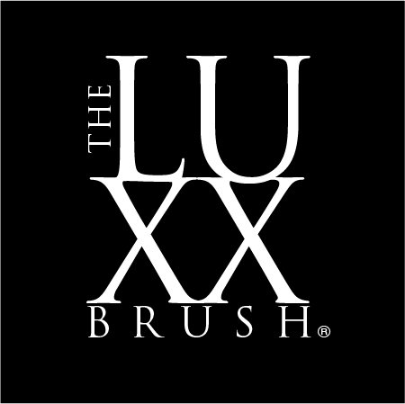
The LUXX Brush™
Carlo_5 | Tue, 01/09/2018 - 16:56
Brief from client
Create simple but attractive, type dominant, logo to match the name of the product to be released.

This is a logo and packaging project for a hair brush for wet or dry hair that detangles.
It has undergone multiple name changes. Finally the client settled on what I have presented as well as this version of the logo.
I am happy with the way it came out. But, thought it might be fun to get some feedback anyway.
I am showing the white on black version because primarily the logo will be applied in white paint as well as printed in white on black.


5 Comments
Another no critique.
Can't speak for everyone but maybe don't lead with "it's already in use" because people know you are not looking for help/direction and are not as likely to take time out of there lives to give feedback.
It kind of comes off like you just want us to see a logo that someone paid you for. Make sense??? Just a thought. =)
I didn't even try to critique your other logo because I really don't know jack about graffiti!!!
I believe I did say that on one logo I posted. Yet, it doesn't say that here.
The product packaging is not finalized yet, so there is still time to make edits.
Maybe not the name but the design.
I do agree about posting a logo that cannot be edited. That was a waste of time.
Probably should take it down.
And no - I have no agenda about presenting paid work, it really makes no difference to me.
Yet here. I am a bit stuck. The name has been changed so many times and not only does it need to work on a thin cardboard back but on an appx 1.5 inch brush handle, for that it would likely be modified to just LUXX.
Ok- well here is my critique- over all this is not bad. I want the tops of the XX connected so it becomes one big structure. I kind of hate that "the" has to be there, but you found a nice place to nestle it in. I would like a bit more breathing room (not much, just a bit) between XX and Brush.
I also think LUXX all on one line, if you end up there, might be nice- the shapes formed by the double X in this font are interesting. It could allow for experimenting with a script font for "the" or brush" if present, just to add a little personality to the structured font for LUXX.
Good luck.
Thanks,
I will push the XXs in that little space is annoying. Totally agree about "the"
yet, it seems to not bother things in that space.
Will try rest, thanks for your feedback;)