The Marketing Life
jbroussrd | Wed, 01/07/2015 - 15:29
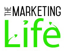
Brief from client
Looking for feedback on the fonts used and having the border around the logo.
Looking for feedback on the fonts used and having the border around the logo.
Looking for feedback on the fonts used and having the border around the logo.
Looking for feedback on the fonts used and having the border around the logo.
4 Comments
I dont think you need so many "paper airplanes, leafs?" Not really sure what is flying around the logo. If you are going to use the symbol then use it once (perhaps only as the tiddle). Less is more.
Unless this is a proof for a badge I'd get rid of the border.
Typography is hit and miss throughout the proofs.
"The Marketing" typeface in B and C are the best, in my opinion. I'd go with the typeface for "Life" in C, although I would argue the small leaves poking out deter from the design.
But the border does you no favors at all. It's a bad practice for a logo design, at least in this manner. It cramps your logos's space too much.
Way too complicated, too many little elements going on at the same time.
This green is way too bright. Did you make sure that the file you uploaded is in RGB?
Good font work though.
Keep it up.
I agree with all of the above. Please could you tell me what the marketing font is? :)