Brands of the World is the largest free library of downloadable vector logos, and a logo critique community. Search and download vector logos in AI, EPS, PDF, SVG, and CDR formats. If you have a logo that is not yet present in the library, we urge you to upload it. Thank you for your participation.
Version history
Version 1

- I
- S
- T
- C


5 Comments
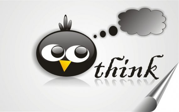
The ideea of the bird thinking is alright. I think it really looks like it's thinking. The execution however makes it look like a clipart. Redo it from scratch and loose gradients (use them only if you learn how to mix them appropriately), the shadows and reflections. The font doesn't work either. Choose one that is not grungy. Also when presenting do it without page flip effects. Good luck.
Too many effects, this is not a logo, but an illustration, but poor one at that. Simplify in every sense.
I agree, is more an illustration than a logo. Make it simpler, will be better.
very busy, when i first saw this, i thought of Badtz Maru vs. Larry the Bird (Twitter Bird)
Yes, I agree to comments above, this is an illustration not a logo. Make it simple and communicative. All the best.