Thirteen Lions
ThirteenLions | Wed, 04/04/2012 - 07:03
Brief from client
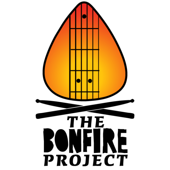
The Bonfire Project is a session/community of musicians from Ottawa, Ontario. Rebrand of previous logo (an illustration of a burning guitar, with the drums stick cross beneath).


2 Comments
I like it, it is immediately identifiable as what you described. I like the bonfire font but the rest doesn't fit. A good rule to stick to (most of the time) is if you have a standout word, like bonfire, in an unusual or decorative font the other fonts should be dead nuts simple. Look at the attachment to see what I you think.
I was having a hard time with the secondary font. I thought the italics and serifs were enough of a contrast. I also had a hard time picking an appropriate orange for BONFIRE. This looks great though. I'll see what the client thinks. Thanks!