Brands of the World is the largest free library of downloadable vector logos, and a logo critique community. Search and download vector logos in AI, EPS, PDF, SVG, and CDR formats. If you have a logo that is not yet present in the library, we urge you to upload it. Thank you for your participation.
Version history
Version 1

- I
- S
- T
- C


3 Comments
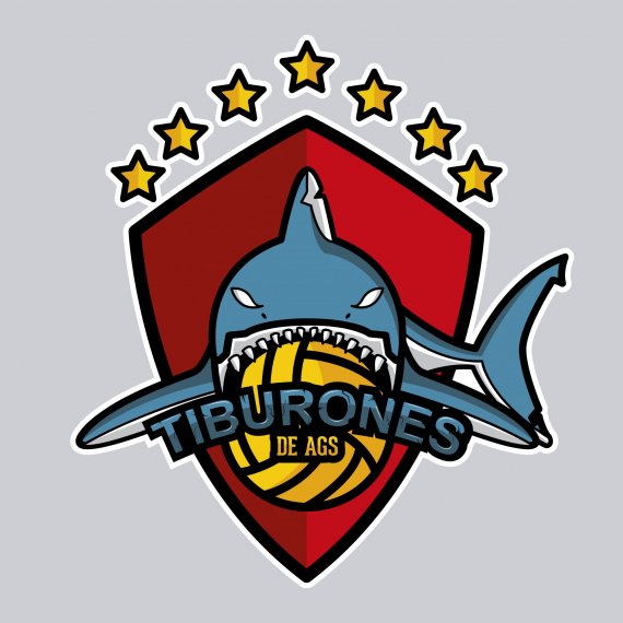
So in general it's a good idea and I like the general layout, but the illustration needs work to make it more elegant.
I like this but it's not done yet.
Two main things that bugs me: the word mark is totally overpowered by the symbol. And there are too many strokes of different thickness. You need to homogenize the whole thing.
Other than that, I like where this is going.
Keep it up.
You are almost there. You need to work on colors (brightness), the whole thing is too dark. And make "tiburones" more contrast to back layout.
Also i would recommend you to simplycify eyes a bit. And cracks on "tiburones".
Good job.