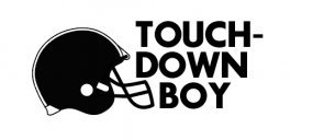
Touchdown Boy
TouchdownBoy | Thu, 11/15/2018 - 16:31
Brief from client
Touchdown Boy (Magazine) is a digital based urban photography magazine that focuses mostly on my artwork + 35mm photography.

Currently I'm trying to get a very 'varisty' style feeling for the logo. Ideally, I will have 3 pieces all interchangeable. The idea is to have an organized sports looking logo, but play off the irony of 'team sports'.
1. Logo with just text + the word Magazine
2. Logo with just text (without the word Magazine)
3. Mascot (pictured bottom right).
Currently, I'm leaning towards the 2nd one on the left side, but something about the size of the word "Touchdown" contrasting with the size of the word "Boy" is really bothering me. Any ideas on how I could work with those words better?


4 Comments
Hi. You are allowed only one logo per post.
Feel free to add variations to the comment section or create another post.
Your post will eventually be edited.
Thanks!
relax dude. Hes just showing his thought process around a single logo.
Probably, but I'm just warning him that his post if going to be edited as there's a disclaimer on the upload page that clearly states that you are only allowed 1 logo per post. I don't make the rules, I'm just a mod. I just get rid this site of spammers and trolls.
That other knucklehead.
1. Erase the hyphen, it is not needed.
2. Try to align the length of "TOUCH" and "DOWN".