Townhome Community Logo
fastsigns370 | Thu, 04/14/2016 - 19:03
Brief from client
Fresh new logo for re-branding. Include fountain graphic.
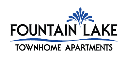
Name of community is Fountain Lake Townhome Apartments.
Found a modern font we like that comes in regular and bold. This is the bold for the roadside monument sign. She really wants a fountain graphic and a wave instead of a line separating fountain lake from townhome apartment.
4 Comments
I feel like there is a disconnect between the fountain symbol and your wave symbol. The fountain is very smooth and geometrically balanced- but your wave is more loosely drawn. I think if you clean up the wave, this will be a nice logo.
I like the overall idea! It does seem that the fountain symbol is a bit cramped and busy. Have you tried it with fewer water droplets? Moving the words "fountain" and "lake" a bit further apart and shifting the fountain symbol up a bit might help, also. I like Joy's idea of cleaning up the wave - maybe make the bottom edge flat so the water looks like it's resting in something, with only the top as a wave?
I tried less water droplets, it just doesn't look as good, and that is the clients favorite part so don't want to change it too much. That darn line is giving me such a hard time! So I have a simple organic line with slight wave to it. I am liking this look. Thoughts?? Thanks! ☺
This wave is an improvement over the original!