Travel Agency
Brief from client
Logo for a company that deals with traveling (leisure and/or business), accomodation and rent-a-car services.
Their logo is outdated (it was created at around 2000) and is too complex (lots of gradients, bevel and emboss, drop shadows). They wanted something new, simpler. They didn't specify much on their needs, just that it has to work on grey backgrounds (because their vehicles are all grey.
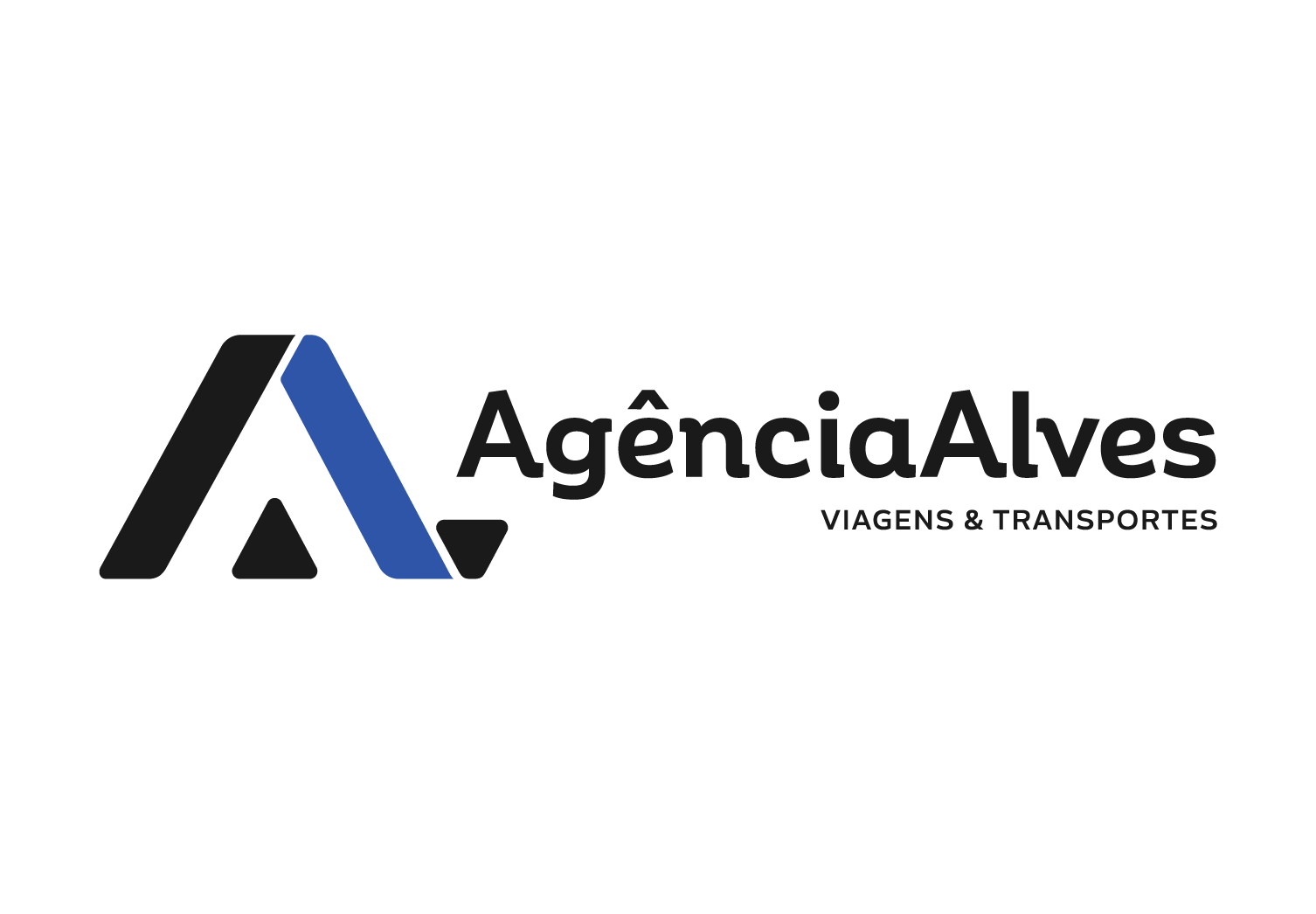
I wanted to the logo to convey movement (from traveling to point A to point B), with the concept of a road making the shape of an A (for Agência). Then, a triangular shape was added below to balance the white space, creating a second A (for Alves).
I am waiting an answer but I have a feeling they are not too keen on this one I think because they were expecting something more... "eye candy" (it's totally different from the old one), so I'm open to suggestions. Also, constructive criticism is always welcome.
3 Comments
Ok, good luck with a company like that. I can only assume if they push back because of lack of flash, you are in for a world of back and forth. I actually really enjoy this concept. The type sits very nicely, perhaps the I may try and make the bottom line just a tad larger and open the tracking up just a tick. See if aligning it to another part of the first line get rid of just a little more of that white space between the logo mark and tagline. The only other thing I might play with is the color. From your brief I can see that you where looking for a movement depicting travel. I read the "A" you are forming. However, the idea of movement or travel gets lost for me. The logo appears to be too static with the black and blue combo.
I would like to see some variations of this for sure.
I like this logo but here's my beefs with it:
- I see what you tried to do with the second triangle on the right side of the symbol, but I don't really read a second A. Moreover, I find it throws the symbol off balance., especially because you have some nice even white space around the first triangle. I would keep things simple and just remove the extra triangle.
The colors are way too dull. Black and dark blue, it doesn't really say "travel", "holidays", "vacations", etc...
I sense some good skills behind this logo. Just consider these changes and you'll have yourself a nice logo.
Good job!
I like it. Can we see the old one?