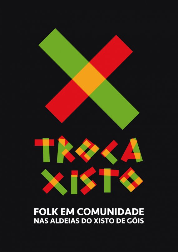
Troca Xisto
fernandolucas | Thu, 07/05/2012 - 12:26
Brief from client
It is a festival of folk music in which the client wanted to set the stage for several typical villages of the region of Góis, Portugal where the musicians are paid for services rather than cash, in exchange for music.


4 Comments
This could really work. I like the colors and the opacity / overlaps, but extending the idea to the main type has rendered it unreadable.
I think that the main symbol needs developing too, maybe not though. Not sure. Address the type issue and maybe it will work together as a strong piece.
http://fc06.deviantart.net/fs71/i/2012/165/a/c/troca_xisto_by_fernandolu...
I like where you're going with this! I'd like to see the black box get tighter to the rest of the design though- less of a black bolder, and it'll make it look taller/more elongated and like an altogether stronger image. Out of the four color examples you have above, the only one I don't like is the red/white/blue one. That pattern that you have swatches off off to the right would be perfect for the back of their business card.
the colors of the logo can always be changed according to the flag of the country of origin of the folk band to play that day.