True Eye Media
Brief from client
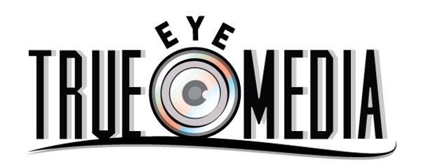
The Client, a start up media company that wanted light colors and to incorporate an actual eye.
I created an an eye that somewhat resembled a camera lens since the focus was photography and photography. In doing this i was able to create both a primary and secondary logo for the client.
The business card is consistent with keeping the clients desire to incorporate "light" colors and also to accentuates the colors within the icon.
The Client, a start up media company that wanted light colors and to incorporate an actual eye.
I created an an eye that somewhat resembled a camera lens since the focus was photography and photography. In doing this i was able to create both a primary and secondary logo for the client.
The business card is consistent with keeping the clients desire to incorperate "light" colors and also to accentuates the colors within the icon.
3 Comments
You may simplify that symbol, About the font I dont see it is cool for a Media company
You say light colors and I see black dominating. I think it is too busy, I agree with Allowski with the symbol.
Too complicated, especially the symbol.
Allowski's example shows exactly what you need to do : simplify.
The font choice is ok, but I don't like the "eye" thing.