Brands of the World is the largest free library of downloadable vector logos, and a logo critique community. Search and download vector logos in AI, EPS, PDF, SVG, and CDR formats. If you have a logo that is not yet present in the library, we urge you to upload it. Thank you for your participation.
Tshirt brand
shanuea | Mon, 03/03/2014 - 12:46
Brief from client
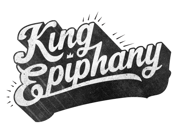
Typographic logo for new tshirt brand.
Client wants it to 'pop' a little more. Any other suggestions would be very welcome.
Love the texture! I'm with Alexi on the top version. I definitely like the set from your "more spam" post. I think the halftones are a way cool touch that adds to the vintage appeal the logo already has going for it.
Overall I really like it, Its a good name and the font's set out in a good style and layout. If I was you I would just keep creating various options for the ligatures and letter connections. As many as possible and explore as much as you can, certain connections are often not needed and others work much better.
For instance, I would try and bring the tail of the last y around to create an underline, instead of using the tail of the E.
Also, I like the connection between the K and the I but it would be nice to try some options with the tail of the G coming round to find the i's dot.
Its good to do some solid research and gather lots of reference on how to create nice ligatures, Shawli has tons of reference on his social profiles.
6 Comments
I like it although i have to say that i think it looks better without the shadow.
I think a bright neon green would look quite funky or any luminous colour actually
Looks great. Great work on the texture.
Haha, Thats just the delicious font your taking note of.
Did you add the Shadow here Shawli? I like this shadow either way.
Haha - such wow critique. :)
Love the texture! I'm with Alexi on the top version. I definitely like the set from your "more spam" post. I think the halftones are a way cool touch that adds to the vintage appeal the logo already has going for it.
Overall I really like it, Its a good name and the font's set out in a good style and layout. If I was you I would just keep creating various options for the ligatures and letter connections. As many as possible and explore as much as you can, certain connections are often not needed and others work much better.
For instance, I would try and bring the tail of the last y around to create an underline, instead of using the tail of the E.
Also, I like the connection between the K and the I but it would be nice to try some options with the tail of the G coming round to find the i's dot.
Its good to do some solid research and gather lots of reference on how to create nice ligatures, Shawli has tons of reference on his social profiles.