Twisted Security
SimplePixel | Sat, 11/05/2016 - 19:27
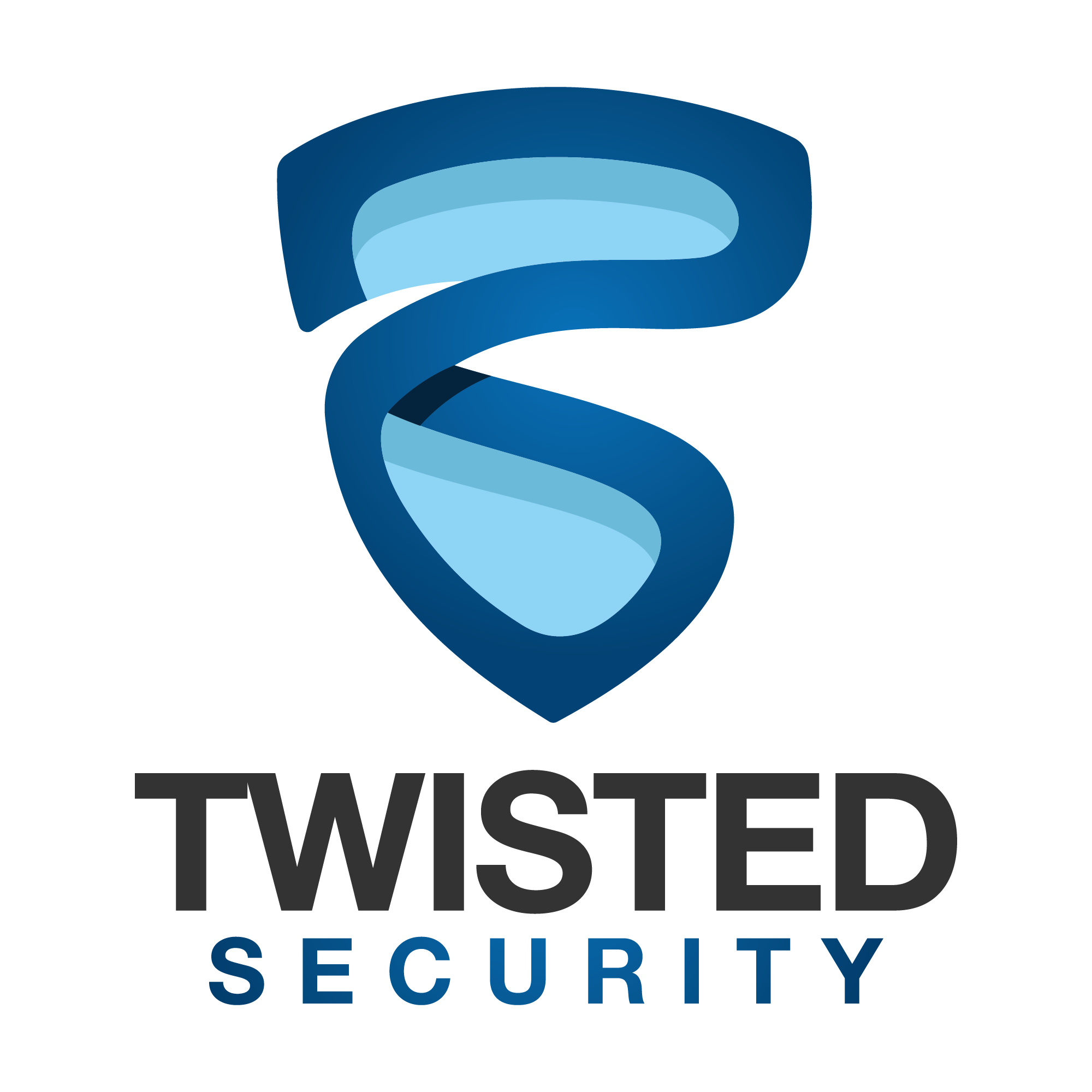
Brief from client
Personal Project
I have made 2 different version of this logo, but this is the final one.
The idea is of a shield that is twisted.
I need to improve it and i would appreciate it if you can point something that is wrong with it or needs to be improved.
Thank you so much in advance.
6 Comments
Hm, I can't see a shield in there, just a twisted "something". My advice is: use a simple shield and put a twisted T in it.
Great logo. Horrible name. Who would trust a twisted (crazy) security company?
I think the idea is a good one, but Perhaps a little too twisted for a security company as botw alluded to above. The Spacing between the TW looks a bit tight compared to the rest of the word. The blues are really nice. They do a good job adding stability to an otherwise twisted logo.
Thank you so much for you feedback. It's much appreciated!
stay away, far far away from basic Helvetica…. change up the colors to be more complementary or contrasting… all that blue is too much… maybe make the inner shield yellow
I could definitely see it was a twisted shield before I read your brief. The color and symbol are reminding me of Superman, for some reason. But I know that's a stretch, after all, he was the man of steel with a similar emblem on his chest. Headed in the right direction for sure, good luck!