Typography Logo Feedback
Kannav Bhatia | Sun, 07/12/2015 - 21:26
Brief from client
Client is a EPC company looking for solid logo.
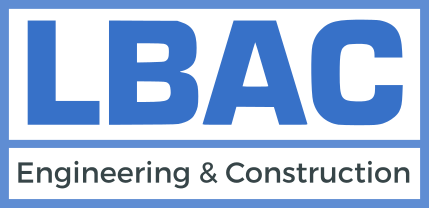
The logo is just word mark with the box showing order. It is meant to symbolize strength.
Client is a EPC company looking for solid logo.
The logo is just word mark with the box showing order. It is meant to symbolize strength.
5 Comments
Have you spent hours of sketching, brain storming? This one looks bland ,
boring and no symbol. Well, if you decided to go in a direction with text/subtext only - it has to be a superb font to be memorable and sharp to have any impact on a client. Why there are three different colors besides white?
I've certainly seen much worse DIY logos. This one is at least clean and legible.
I do agree though. This isn't particularly memorable as it stands.
You will get my list of things to do. For first logos especially.
1. Research. - Look at logos. A bunch of Logos. Then some more logos. (Charlie has a great list of sites, here are some: www.logopond.com www.dribbble.com www.pinterest.com)
2. Brainstorm - Take your company name, as well as some of their ideals, products/services. Branch off from them, even if it doesn't make sense. Spend a good 30 minutes.
3. Pair the words, or pick words you really like. It doesn't need to make the best sense, or be from the same tree. If you have Dinosaur + cowboy - hey go for it.
4. Sketch some ideas. I would say about 6 of the pairs.
5. Pick the three that are working the best. Spend time on them. Sketch and refine.
6. Refine more.
7. Refine more more.
8. Turn on your computer.
9. Take the best of each of those 3 ideas and scan them in.
10. Bring us those 3 ideas.
11. We will help you from there. :)
But no more computer work until see see some sketches! ^-^
Really Loved your Step to step guide. It is of great help, considering the fact that I am not from the same line of work.
I am trying to create a Brand for my family Business. I will give you the insight, full name of the company is 'Lalit Bhatia & Co.' (LBAC) and I was trying to project it as a single word to represent the whole business. I then plan to use that brand name in near future to represent various businesses across sectors. Something like Virgin but at smaller level.
I will surely need to brainstorm on it !
Thanks for the help :)
I agree with all of the above. You should definitely take Waffles' advice just to give it the justice it needs.
Saying that, this is 100% better than the previous version and I could see it working on the side of a machine / truck etc and it wouldn't be a disaster if you did use this, although i'd have engineering and construction the same with as the initials.