TZOI OPTICAL
BUBLA | Tue, 08/04/2015 - 09:37
Brief from client
Logo for a friend of mine who is of Korean descent.
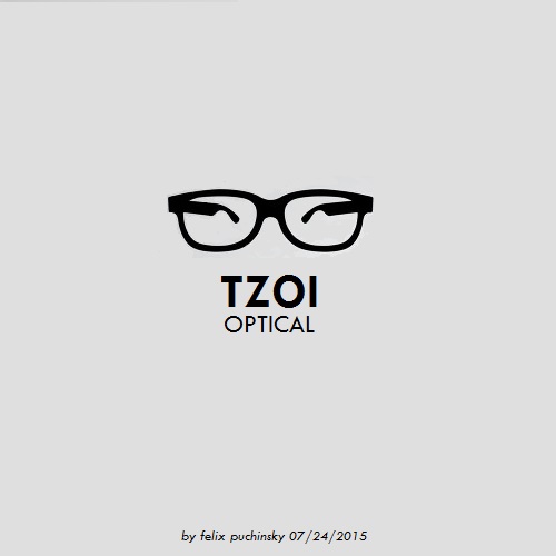
Eyeglasses arms at certain angle naturally created his Asian shaped eyes.
Logo for a friend of mine who is of Korean descent.
Eyeglasses arms at certain angle naturally created his Asian shaped eyes.

 Partnered with Clios.com | Ads of the World
Terms of Use | Privacy Policy | Cookie Policy
© 2021 Clio Awards LLC.
Partnered with Clios.com | Ads of the World
Terms of Use | Privacy Policy | Cookie Policy
© 2021 Clio Awards LLC.
6 Comments
I am certainly not a member of any PC police, but the idea behind this is beyond stupid and slightly racist. The fact that the client is Asian has nothing to do about his job and his ability to do it effectively.
Fortunately, I just see some random pair of glasses. So racist or not, this is not working.
It has been a long summer for me and yesterday I finally got back behind the wheel of my school bus and drove kids to school and then brought them back to their homes. It is a good feeling to be back to work and I love kids and they love me. Anyhow, I see a difference of opinion here and that is fine with me - that is why we are here to get better. When I work on this one - my only goal was to create a portrait of a person thru a pair of eyeglasses. I never thought that it might bring some controversy into a mix... Now I see that it did - something to learn for a next time. I have no problem with either comment and glad that it appears different to viewers. The thing about graphic design or any other forms of art is that as soon as it has been displayed for a general public - it will generate different opinions. That is part of life and we have to be prepared for that.
I think you're smoking too much dope man hahah
apart of that i think this idea has been used an over used, that's why i put a thumb down on that and the symbol. can't really see the asian eyes...but i think it's a bad idea anyways.
The symbol seems redundant and stale (solid drawing though) and I didn't see the eyes at all till I read the comment. I think you could do better. Time to sit back and really harness the theme here, try an Asian symbol with some optical undertones or vice versa if you are trying to complement the Asian theme, rather then trying to depict a physical feature of the race.
I instantly saw the Asian style eyes in this.
For the purpose of an optical store owned by a Korean, no I don't think it is a particularly good idea for a logo.
However, I do think it would be a great logo for Super Kawaii Kitty Optical Princess Girl Adventures! Like, a really good logo for that. ^-^
i like your job
i got what symbolizes the logo and simple style is important that I felt happy
i wish you happiness
thank you