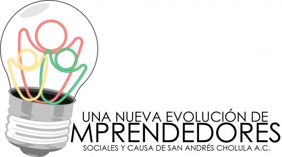
Una nueva evolución de emprendedores con causa, San Andrés Cholula A.C.
IrieGanjaBoy | Mon, 11/20/2017 - 18:38
Brief from client
As a NonProfit Civil Association, we look for unity in our community, and work for the benefit of it, by hatching ideas into working projects for the people.


4 Comments
This is not working at all, unfortunately. Not one bit, I'm afraid.
Overall, it's way too complicated. The wordmark is way too long and wordy, with 3 different font sizes, which is too many. Using only one font makes this logo very dull.
Also, it reads "mprenderdores". Everyone is going to read it this way. I didn't see the big E in the light bulb before you told about it in the description. The E and the rest of the word are totally unrelated visually and graphically.
The light bulb itself looks like a clip art you've picked up some vector library. If it's the case, just don't. It just makes your logo cheap and lazy.
The 3 little characters just add to the overall complexity of this logo. It feels likt you try to incorporate too many ideas at once. Again, don't. Keep things simple.
You need to get back to the drawing board, do a bit of research, a lot of inspiration and even more sketching (hours upon hours).
Keep it up!
^ what they said :)
Simplify your logo, & the way I would do it is with a continuous line so the whole bulb is like the filament, & a path colour gradient which blends from black/grey to the bright colours when it reaches the people.
Here's a nice simple example of a continuous line symbol:
although if someone uploaded that here they'd probably say it looks like a 2-headed ghost feeling it's own breasts, but you get the idea
I can see a diverse of people happily trapped in a light bulb. Next, simplify, simplify and simplify.
Limit your color scheme and start hating gradient especially on logos, although yours is not exactly gradient. Personally, I really don't prefer gradients on them just because it shows your a starter.