Up-Root
Erin Fitzgerald | Fri, 08/07/2015 - 20:54
Brief from client
Up-Root is a homeless youth outreach program.
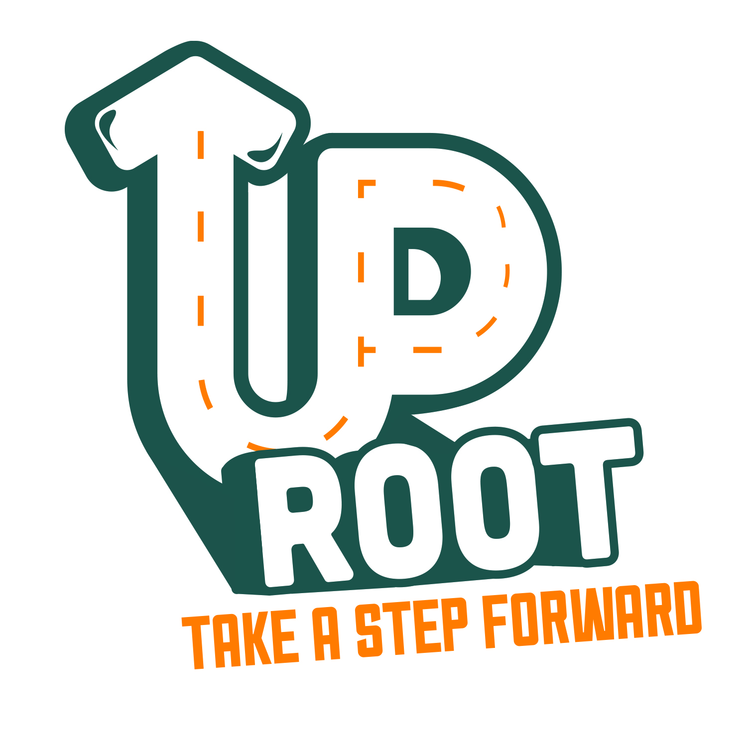
Up-Root is a homeless youth outreach program. I created this for a senior thesis project on the homeless youth epidemic in the United States. I designed the brand to have an urban feel and appeal to a youthful audience.
4 Comments
I really like this logo.
Watch out the dashed line in "up". It's weird in the buckle of the P. Some tweakage may be needed in the "shadow" of root, especially behind the first o and the t.
Other than that, it's job well done.
Sorry to be a spoiler here, I do not like this at all. I would re think the whole idea over.
Agree with Shawali here. I, too notice a shadowing issue on the first O. Not feeling the street lines either.
The tilted type also bothers me a bit. Can you show us a version with level text?
The more I look at this, the more I like it. Good job overall.
I'm not a fan of swashes inside the top of the arrow (it doesn't match the rest of the design), as well as the dashed line (for some reason the dashes in the P are thinner than the rest.) you should fix the shadows. overall I can see the urban look of it but im not sure if like it, the UP with the arrow have been used and reused.