Vandaele Construct
Jesse Mogensen | Tue, 10/04/2016 - 22:29
Brief from client
The logo must especially radiate the main activity: construction industry (and to a lesser extent, housing). We like it to be simple, not too crowded.
Also, we'd like the color to be blue.
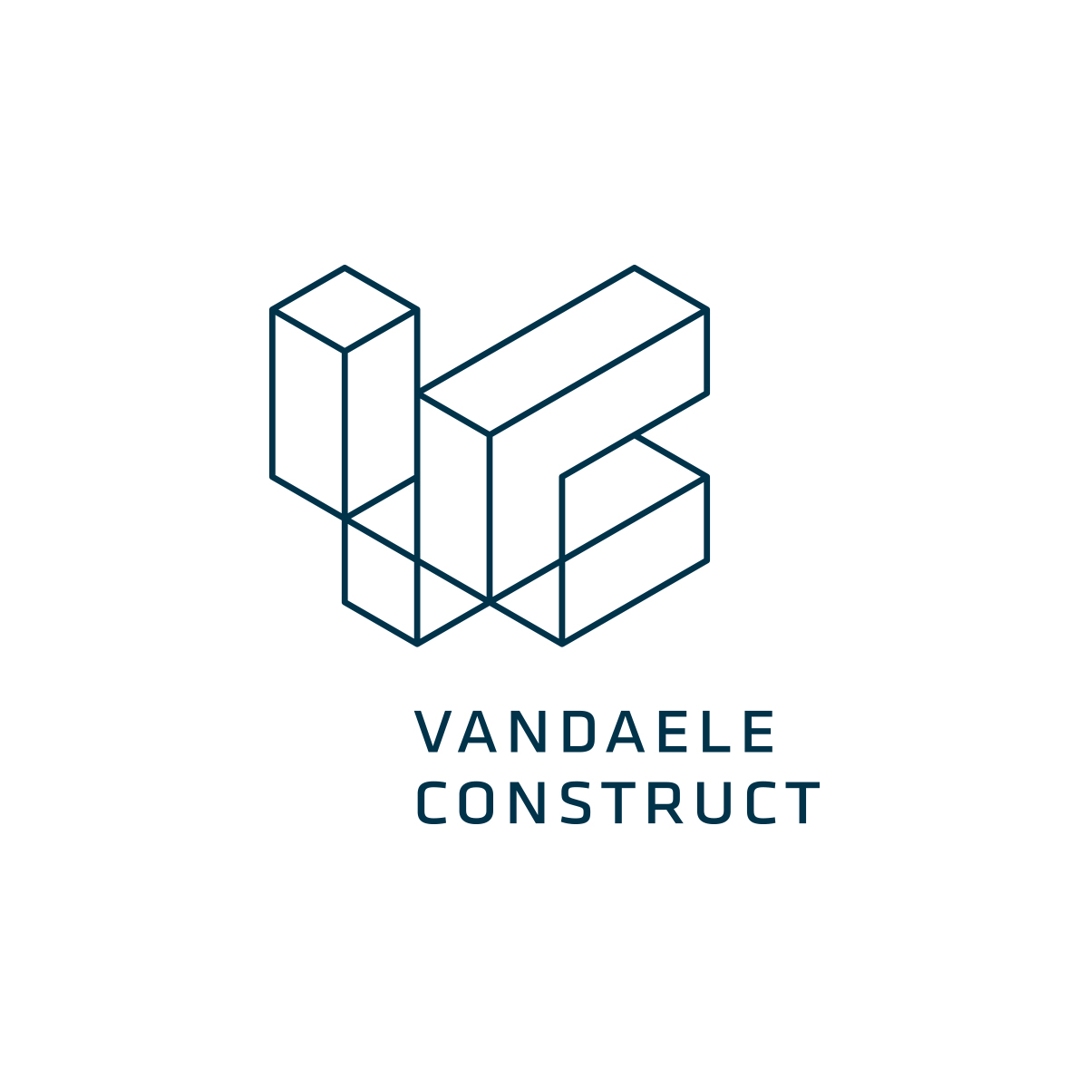
The logo is made of contstruction blocks/pipes, of which the left side says 'V', and the right side says 'C' (from Vandaele Construct).
What do you think? I'll post some alternatives in the comments.
I'm not sure about the blues. I just can't seem to find a suitable/tasty combination. Also not sure about legibility.
6 Comments
Variation one
Variation two
I like the lines version, simple and clear
It's a really cool logo!
Out of the 3 my favourite is the third, but they don't have to be mutually exclusive.
Good job!
Sorry, I have to disagree. This looks too complicated. Without studying it for a bit, I don't even know what I'm looking at. Variation 2 is closer but again, simplicity is key.
I hate to be the party pooper, but I have a few issues with this. The symbol is cool to look at for sure- but I do not easily see the V or C and I don't think it's very effective as a logo. And the type- I'm not a fan of it being off centered.Throws the balance off. And I feel like if it's going to be the same size, same font, and all caps- it should be center justified or maybe all on one line. It is awkward to me how it is all laid out here.