Vander Studio
kikippi | Mon, 12/18/2017 - 11:42
Brief from client
Logo design for a photographer studio.Studio works are mainly portraits in black and white, his style is classic, not too fashion. this said, the logo should be appealing for fashion brands, simple, clean and modern
5 Comments
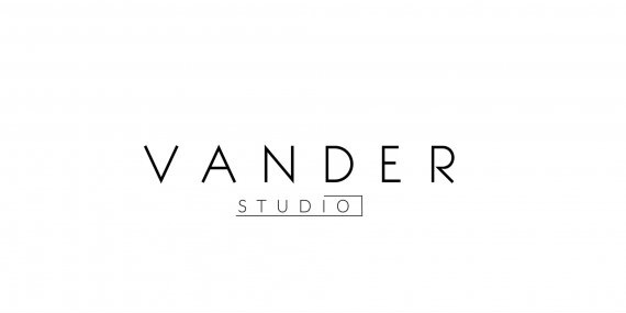
I like this but I think the studio maybe a bit too small or a bit too light. I wouldn't go much larger or darker but perhaps a bit. If feel out of proportion to Vander. Love the simplicity.
i dont get the unfinished bounding box around "Studio". also, studio needs to be a heavier weight so it doesnt compete with "Vander".
I believe it is intended to form a camera =)
I like it I didn't get the camera at first though. This is the best of the four versions you've got here.
It would be nice to see a version done using fonts Bodoni Reg. And Futura Light or Medium. This is a "classic" fashion oriented serif and sans-serif combo. If you don't like those two fonts try something very similar. I think you will be pleased with the results.
I am not understanding the half box that is going around the word studio.
It is confusing and also seems to be pushing the spacing between both words further away than necessary. Perhaps try a single line somewhere for emphasis. Less is more!
I don't really see any colors or shades, maybe in version 4 - In any case again going for classic perhaps try Vander in Black and Studio in a shade of grey or vice versa.