Vegan Takeaway
jamesturner | Sun, 11/06/2016 - 11:23
Brief from client
A vegan takeaway company called LeafyFresh wanted a new logo for thier takeaway company, however they wanted a logo that did not include the hand drawn leafy on its own for the logo as they felt it was overused. They use local produce and homemake all produce in house.
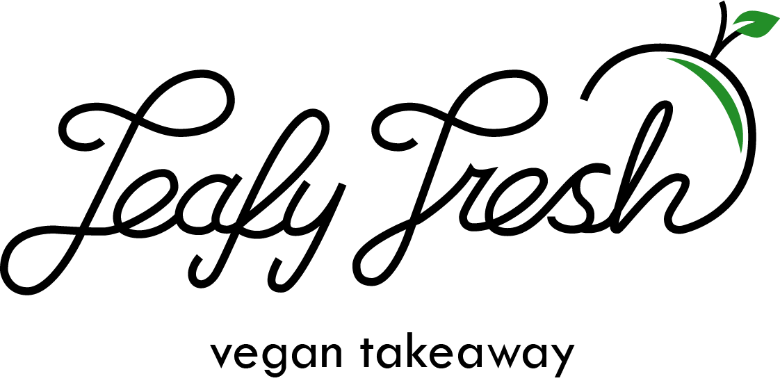
I chose to go with an apple as I feel it represents the food that leafy fresh produce, although on the top I chose to include the vegan logo as the leaves on the apple.
The colours are subject to chage.
I went with the monoweight hand lettering as I feel it works well for the modern style leafy fresh has whilst also working well with the homemade aspect of the business.
3 Comments
Once again, good move on going for a hand lettered logo. But it needs some work because it's easy to read.
The L looks like a T, the F like an L, the F like a T also.
You also want to make your characters more consistent vis-à-vis one another. Especially that A which looks small compared to the E.
Not a fan of the branch with the misplaced leaf at the end. It kinda put the whole thing off balance.
The subtext could be refined some more.
Keep it up !
This is really hard to read.
The 'L' and the 'F' are nearly identical and it confuses my mind as to what either of these words are. That is not how cursive 'f's work, in either upper or lowercase. The 's' is also not normally how someone would write one.
The apple at the end is an interesting idea, but I don't think this works as is. Sketch and refine! :)
Hard to read. Idea is average. Doesn't feel 'fresh' or 'organic'.