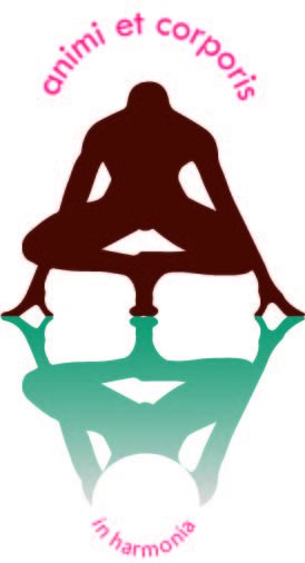
vetruvian man
Annedien | Wed, 08/07/2013 - 12:57
Brief from client
The client wanted a vitruvian man logo with a ying-yang effect trough the middle of the body. 1 half should be 'solid' and the other half should fade away representing matter and ether. He is starting a life coaching practice integrating some martial arts elements.

This is the 2nd version. I let go of the standing version of the vetruvian man. I choose this pose because it expresses a bow, a strong start posture and a moment of reflection. Dynamics i associate with the practice of my client
I am only struggling with the the text, position and font style.
Maybe someone can give some ideas for me to explore.


4 Comments
This idea is better than the first version but the graphics are not well executed.
Ok , i don´t like it!
First, the figure at the bottom looks beheaded (check your files before uploading!!), the colors are not atractive, they are too soft for something related to martial arts, and ( I don´t mean to be sexist but i have to say it) too femenine.
The leyend is a not well posistioned the lines in the upper part follows one circle and the part in the bottom "in harmonia" follows a smaller one so it contributes to make it look not fluid nor integrated.
By the way i think there´s a lot of poses of martial art that you could use that will be more effectie and supportive to the concept of the vitruvian man. Consider a lotof typographic options before you end the next idea, typography is important and since the message is not a very short one, you should consider it.
Here i give you a rough example of some of the things I pointed is just a quick image based on the description so you can start thinking it over.
Way too complex and unpractical.
Get rid of the reflection, and make the font more prominent. Forget about the text on path thing. Keep it simple.
Change this these terrible colors. Maybe stick to simple black and white for the moment.
Even if it isn't very good, I prefer the first version.
Good luck!
http://losttype.com/browse/ Take a look here for fonts. And for the symbol, you have to spend more time on it, in order to be more original. Also, get rid of any shadows, gradients and pink colors (in this case).