Brands of the World is the largest free library of downloadable vector logos, and a logo critique community. Search and download vector logos in AI, EPS, PDF, SVG, and CDR formats. If you have a logo that is not yet present in the library, we urge you to upload it. Thank you for your participation.
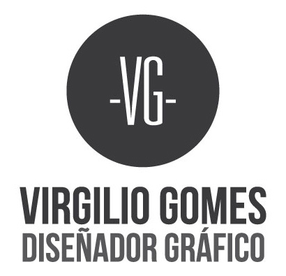
First, maybe (surely) you need to recenter the dashes on each side of the initials so they're positioned in the middle of the x-height.
Then, I'd use a different font for the subtext "disenador grafico". Or at least a light weight. Right now, it's too much, especially with the tilde and the accent on the A, it's difficult to read.
I would give a thumbs up for the typo but the problems shawali talks about are valid. I like the typeface a lot but you got to work at position a little. Good job with the rest of the stuff, really nice logo.
3 Comments
This looks good, but it could looks better.
First, maybe (surely) you need to recenter the dashes on each side of the initials so they're positioned in the middle of the x-height.
Then, I'd use a different font for the subtext "disenador grafico". Or at least a light weight. Right now, it's too much, especially with the tilde and the accent on the A, it's difficult to read.
Be careful with the kerning, too.
I would give a thumbs up for the typo but the problems shawali talks about are valid. I like the typeface a lot but you got to work at position a little. Good job with the rest of the stuff, really nice logo.
Like said Shawali, this logo is good and makes your brand very professional but, in my mind, it misses a little something to become perfect.